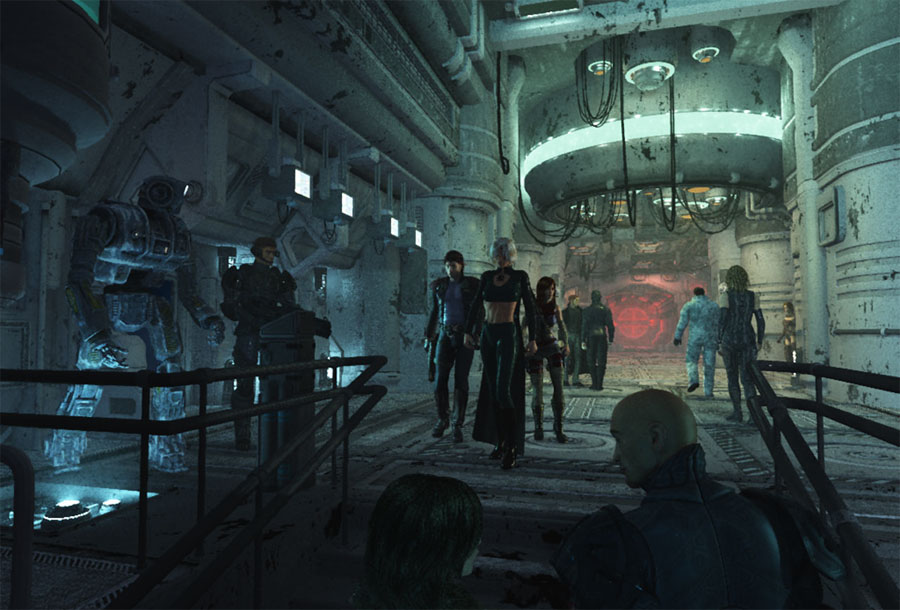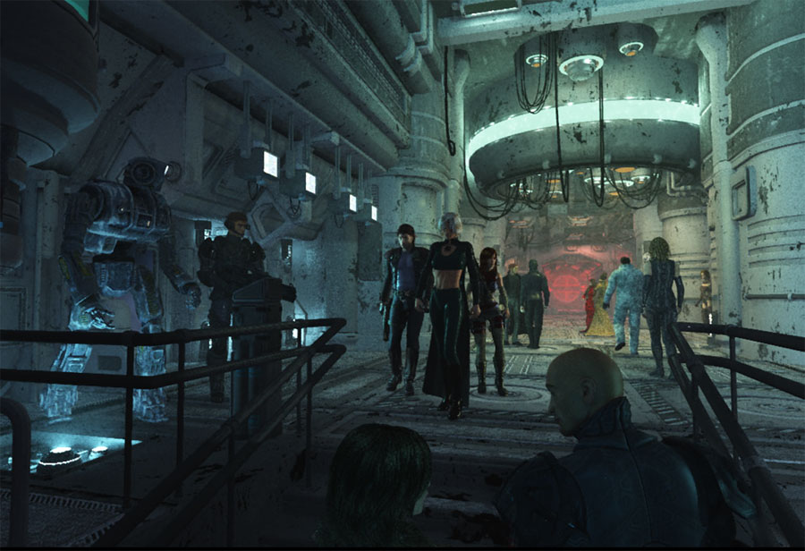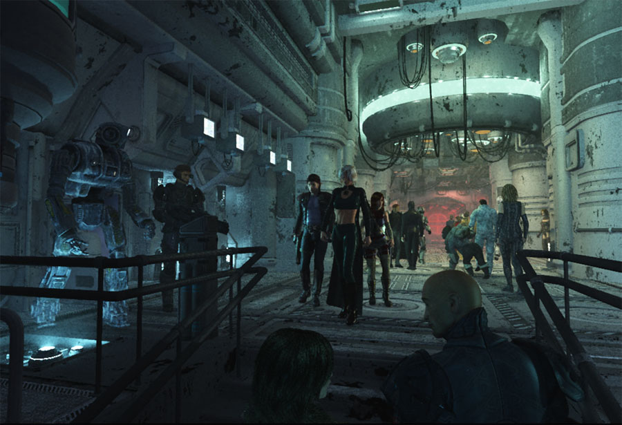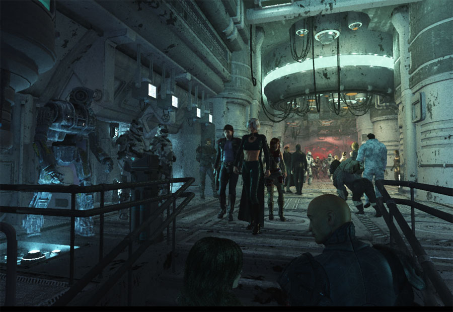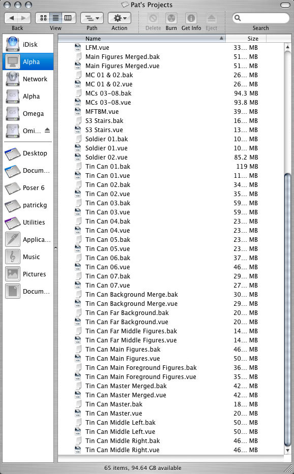
First I'd like to point out I am a firm believer in saving often and saving multiple versions. By the time I completed the final image I saved well over 34 different Vue files. Some of the less important files were eventually deleted, but in the above screenshot of my projects archive, you can see my folder still contains sixty five items--32 of them are original Vue 6 Infinite files saved at various stages of progression. This does not include all of the original Poser files, texture maps, or saved VOB object. Hundreds of other files have been saved in addition to these Vue files.

One of the benefits of saving all these file versions is I have been able to go back and take individual screenshots of each stage of the project in order to point out a few tips and tricks, as well as, give you an idea of how I worked my way through to the final image.

Just to give you an idea of the size of the files, this folder contains approximately 20 GB of Vue files.
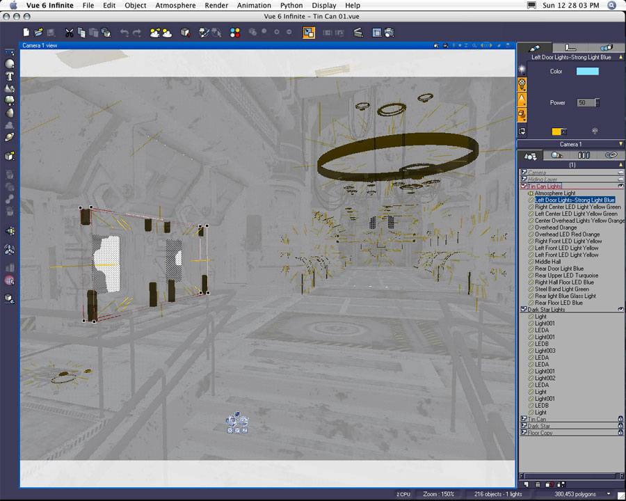
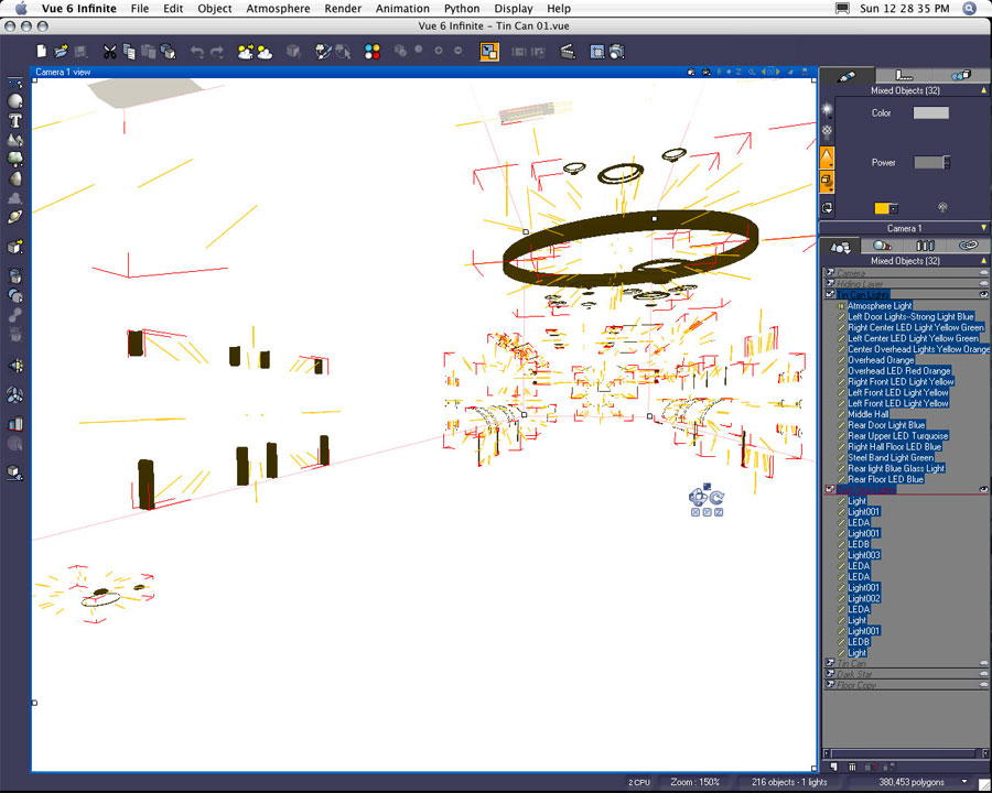
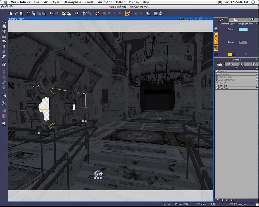
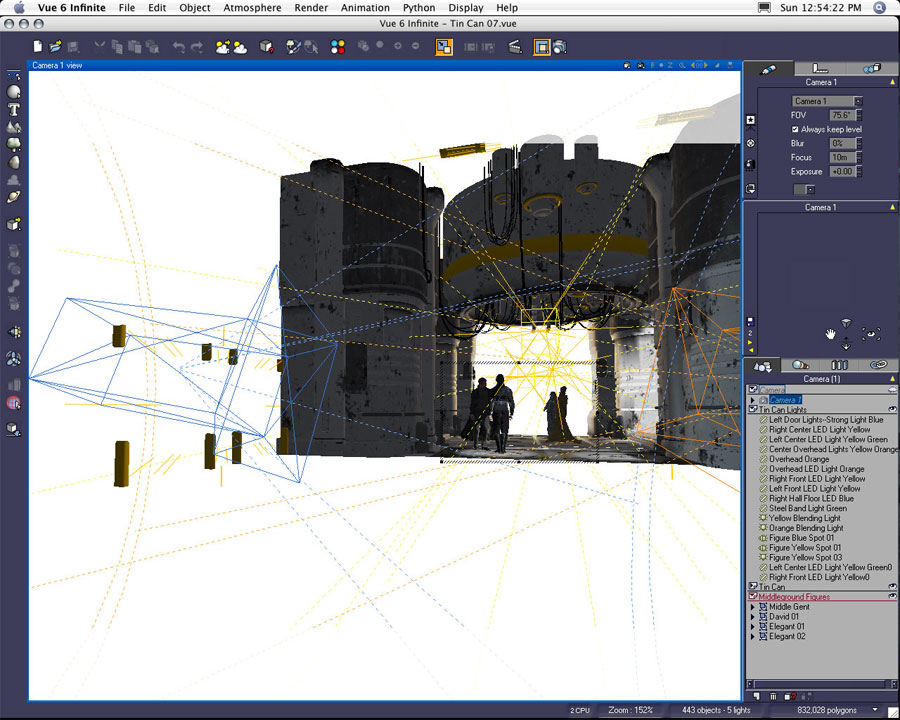
This is the earliest version of my scene saved as just the interior environment without figures or additional objects. The first two to three weeks I spent setting the scene up as seen here. I spent the majority of my time working on individual materials, lights, and overall atmospheric effects.


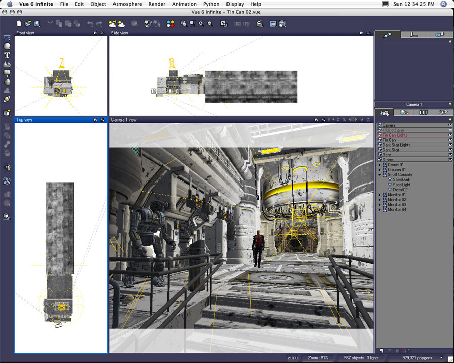
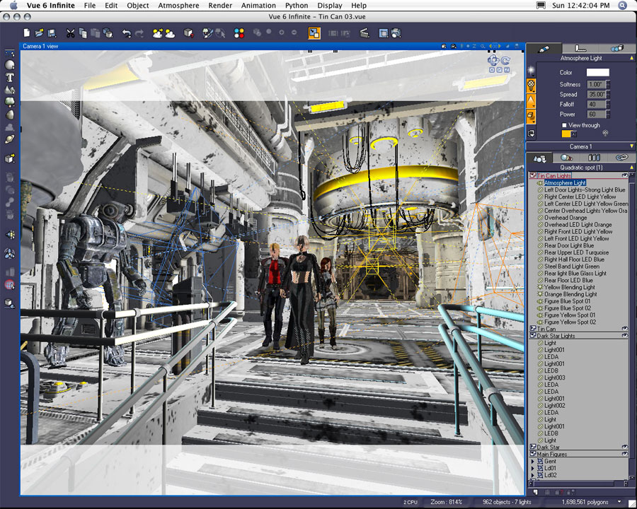
At this stage all but one of the lights are objects converted into area lights. Although there appear to be only 32 lights in the scene, many of these converted area lights are actually groups of wireframe objects baked as one object, and then converted into one area light. The left door lights, for example, are actually eight objects. Even though they have been converted into one light, they still cast their own individual illumination within the scene. The light materials, effects, and strength are programmed as one light--I couldn't edit the individual objects separately. However I gained the benefit of consolidating the scene with fewer lights. The overall effect appeared to be the same since each of these hundred-plus converted wireframes appeared as separate individual lights in my renders.


Here's a screenshot of the interior with all primary set pieces visible. I want to point out one of my work habits. I do like to keep objects organized within my layers/world browser. As I build a scene, I sometimes find it necessary to remove objects, but I may not want to permanently delete them from my file. I usually create a "Hiding Layer" in order to place potentially unwanted objects out of the way. I keep these objects around until I feel comfortable deleting them from my file. But in the event I have deleted an object in a later version of my project, I could always come back to this original document.

The "Hiding Layer" in this document contains all of the original wireframe objects that went unused. If I really needed to, I would delete all the other layers with the exception of my "Hiding Layer," save the "Hiding Layer" as its own document, and then "merge" the "Hiding Layer" document into a later file. By doing this I preserve all the original position and size information of my hidden objects.

In later files I delete the "Hiding Layer" in order to preserve space and system resources. Again, I can always come back to this file if I need any of my deleted items.
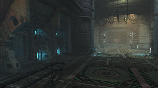

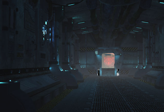
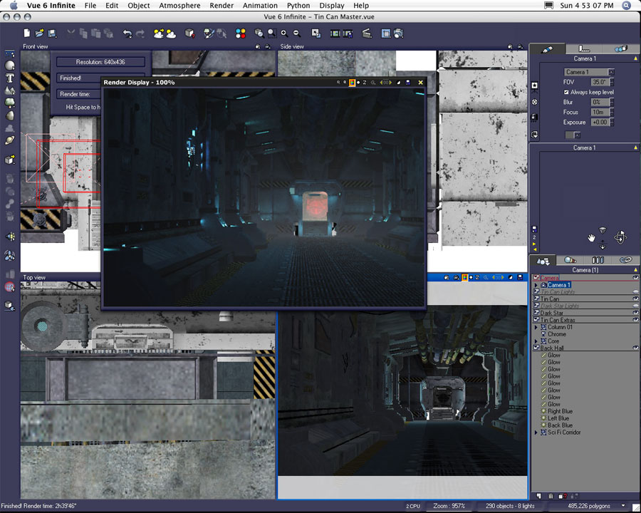
This is one of the first test renders of my scene created back on the first day I started working on the project. This is Stefan Morrell's (Stonemason) Tin Can model as it was first imported from Poser into Vue 6 Infinite. All of the original textures are still in place post import. I had just started to convert objects to area lights. You can also note the volumetrics of the various lights are set a little high.

The Tin Can originally had a back wall. This was eventually deleted in order to accommodate the addition of Stefan's Dark Star model in order to define a greater depth to the interior space.

This was the final render of the station interior prior to the placement of figures. It was at this point the main environment lighting, atmosphere, and the interior textures were completed. Although additional lights and objects were later added to the station, the majority of what you see here did not change.

Figure Preparation Part One: Skin Materials


As I began adding figures to the station, I created separate files for each individual figure. I was able to import and edit Poser figures separately in smaller, manageable files. When a figure had been fully prepped, I would then export and save the model as a VOB within my objects libraries, or I could "merge" the saved Vue file into the larger composite.

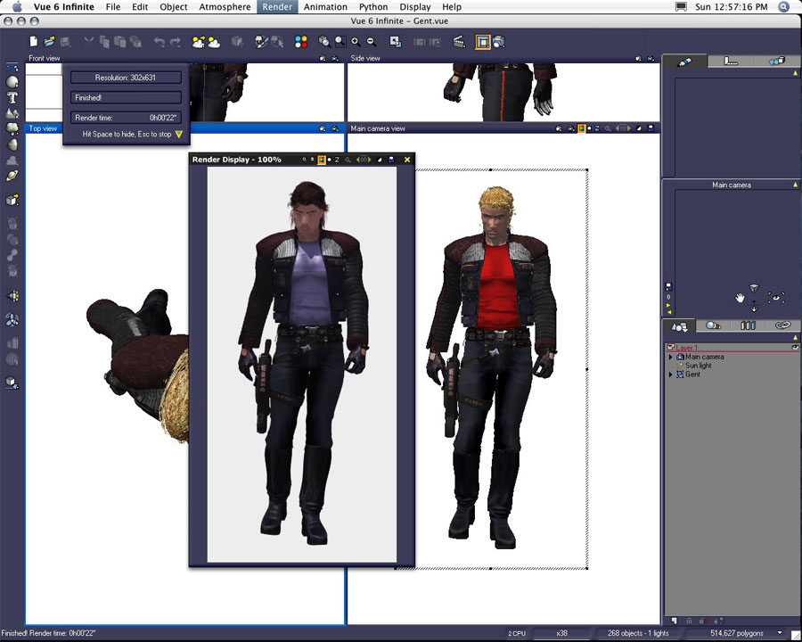
The "Gent" figure was the first figure I brought from Poser into Vue. The figure is a Daz Michael 3 (M3) with Cuffed Tail hair wearing Uzilite's Hardcore clothing items.
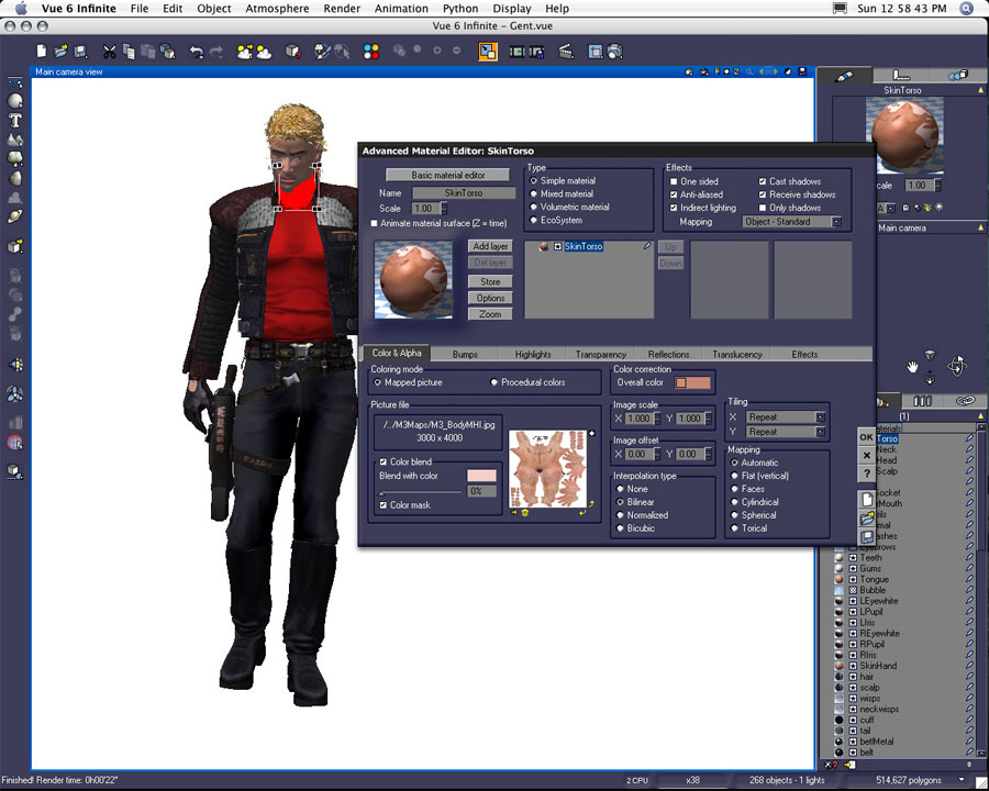
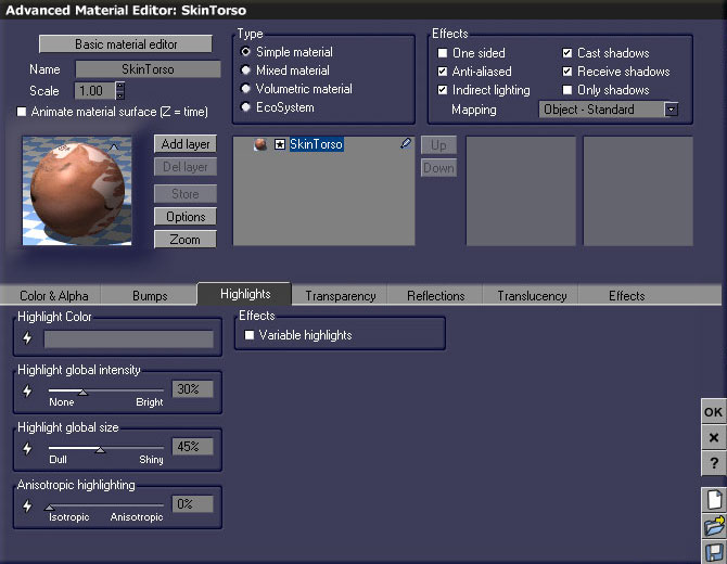
With all the figures I used in the finished Lirhful Station image, I thought I'd point out an example skin material. I do systematically check the textures/materials of each imported object. I will modify virtually all of the imported materials.

Although I do make variations to skin textures figure by figure--each texture is colored and highlighted differently--I tend to stay within the same range of colors and percentages when working on human skin tones. The first screenshot references the M3 image map and the colors used to define the overall texture. The second example showcases the settings I used for the skin tone highlights. I like using a light medium to medium neutral gray to define my highlight color for flesh. I usually keep the highlight intensity between 30% to 40% and I will assign a global size to the highlight between 30% to 50%. But it varies--this is an average modification.

The choices I make for skin materials evolve out of trial and error. I will create several test renders during the time I edit textures on a single figure. I also try to set up similar lighting within these figure workspaces. I try to create a similarity in the lighting to match my main files in order to make the best judgements as to how this figure will probably look once it has been imported into the main Vue scene. Even after it's been imported into the scene file, I do find myself going back to edit materials settings.
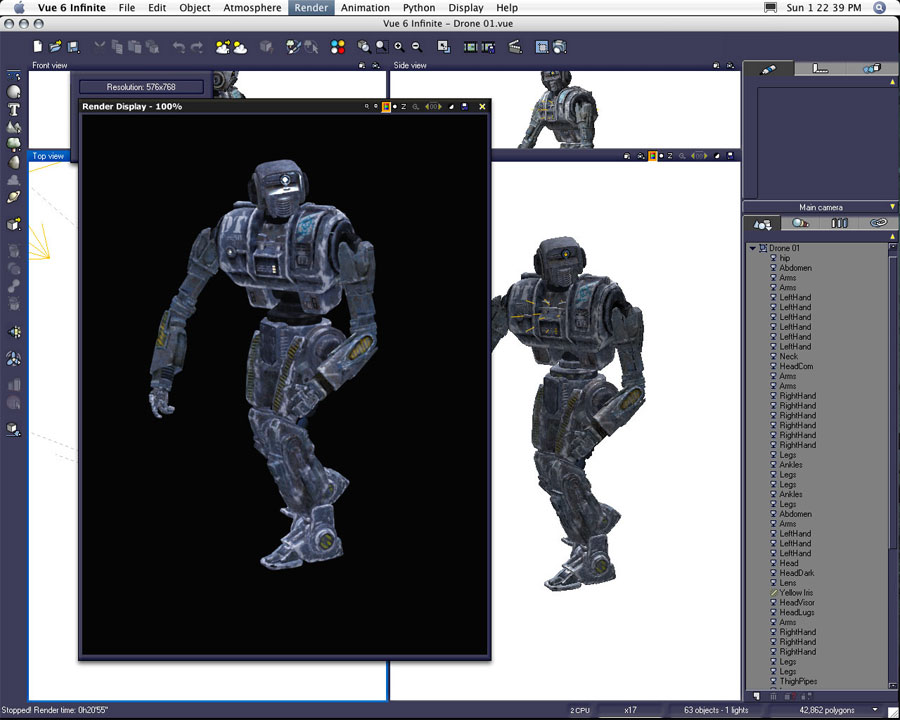
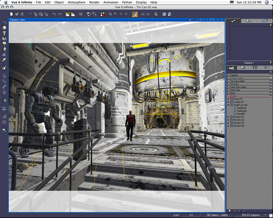
The Drone Trooper figure was created by Stonemason and Moebius87. I love this figure, and I end up using it a lot in my science fiction images. When I prepared the figure to be placed in the Lirhful Station scene I not only adjusted the material settings, but I turned the LED objects into area lights. I used very small strength settings for the LEDs. The effect is unnecessary since I have found luminous textures tend to have the same effect. Also the yellow iris of the Drone Trooper's eye was originally used as a light. In earlier renders I kept the light in place, but ultimately decided not enough of the effect was visible since the Trooper's head was turned away from the camera's POV. The yellow iris light was eventually deleted.

Building the Scene with Imported Figures and Objects


In the second saved version of my file I began to place figures. The gent figure was initially placed towards the middle ground Uzilite's Hardcore clothing was too nice to keep so distant, so eventually the gent's figure moved forward in position in order to see more detail in the figure.

Although the four hanging monitors were added much later in the development of the scene, I did return to this version of the file in order to test their placement. In later versions of the scene files I eventually brought brand new imports of these monitors into their final positions. Note the final render showcases the monitors tilted down towards the main group of figures.
A four cameras view of the same scene highlights the scale of the station setting and relative position of the camera.

Separating the Scene into Multiple Files


As more figures were added, I discovered my threshold for polygons stayed around the 2 million mark. Each time I tried adding another figure (around half a million more polys), my file would be very unforgiving and crash. It was after the four figures seen above were in position I realized I had to narrow down a working solution for my file issues. I didn't want to decimate any of the current wireframe objects. Yet I really wanted to add at least thirty more figures.

My first attempt to rectify the issue was to double the amount of RAM in my Mac from 2 GB to 4 GB. I bought and installed the additional RAM, but the effects were negligible on my larger scene files. I knew I would need to break the scene apart into several files which, when rendered, could be composited together in Photoshop.

This file became the base for all the separated files.
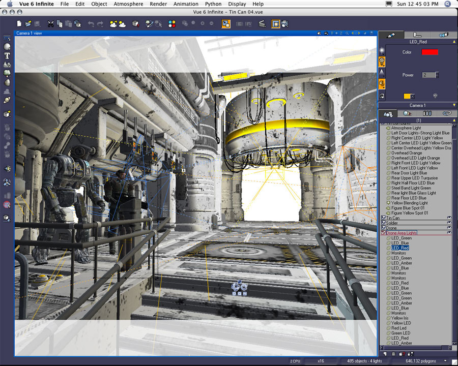

I then began to build the left foreground file. By deleting the background elements which would not be part of the overall composition (nor would the deleted areas affect light or reflections within the desired left foreground area), I brought my file size down. I used this as the working file to arrange what would ultimately fit into this area.

I did keep any lights which would potentially influence this portion of the scene--including those which did not illuminate any of the left area directly.

This file eventually became the middle foreground.

The two figures have been reduced to piecemeal torsos. Any aspect of the figure's bodies which was either directly not in view (or indirectly not affecting shadow and reflection) was deleted in order to conserve polygon count and system resources.

You should be able to see portions of these figures are missing below the frame.
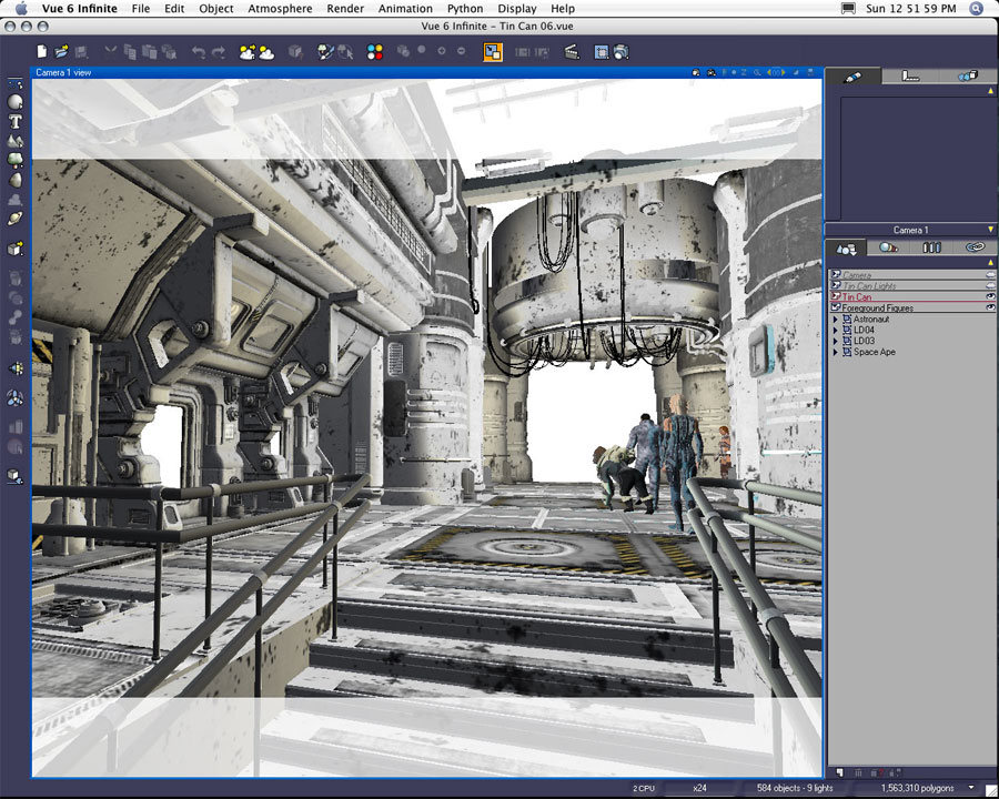

This file eventually became the right fore/middle ground area of the scene. Note the figure arrangement and position differs from the final file. I moved these figures on multiple occasions before settling on their final positions.


This scene was set up to be the far middle ground area. Eventually it was merged with the background to create one far background file.

Since the use of reflective textures became less and less important the farther figures existed from the camera, I was able to delete more of the station interior objects. However, I did leave all the lights in position--even in the foreground areas--which probably didn't have any great effect on the objects in this portion of the scene.
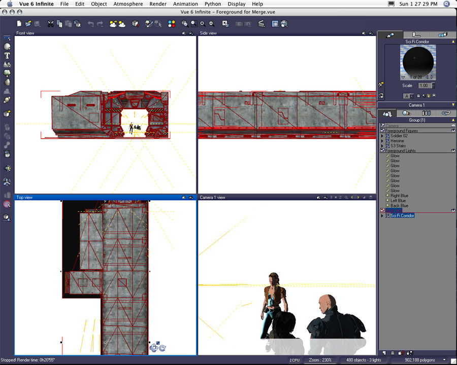
Setting Up Files for a "Merge"


Occasionally I would make so many changes to one of the five primary scenes I would have to update the other four by merging the new elements from one file into the others. New lights, changes to position of established elements, and the addition of new environment all necessitated the "merge" of portions of one file into another.

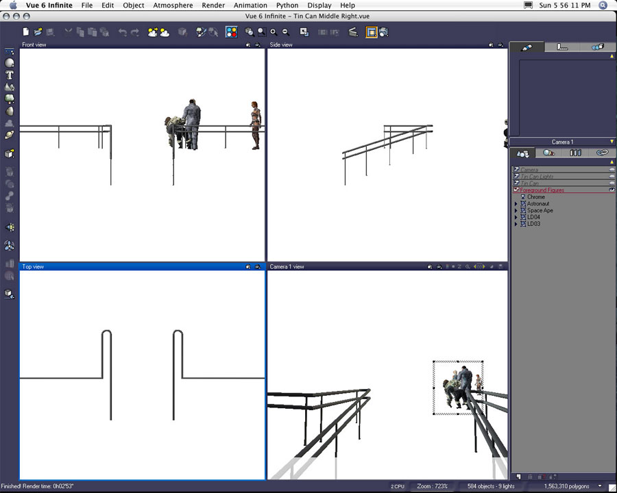
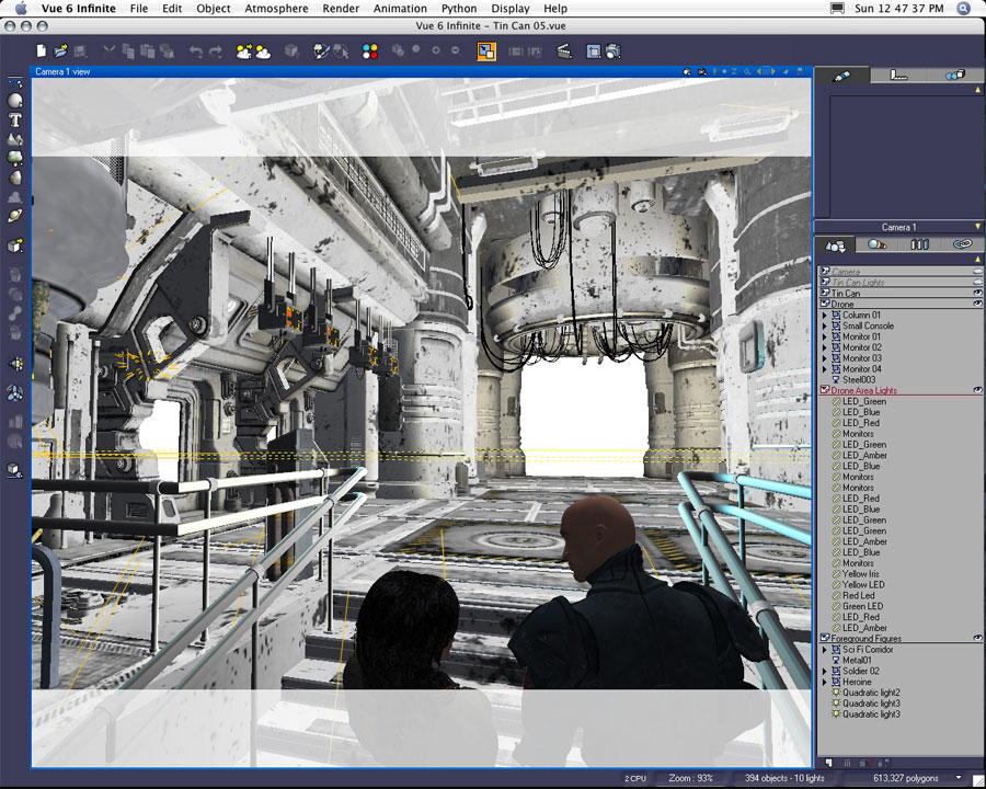
In this example, the Generic Sci Fi Corridor (also a Stefan Morrell product), new lights, and the three foreground figures were merged into my master file in order to create a master foreground file. This screenshot is an example of the elements saved in the file in order for the "merge".
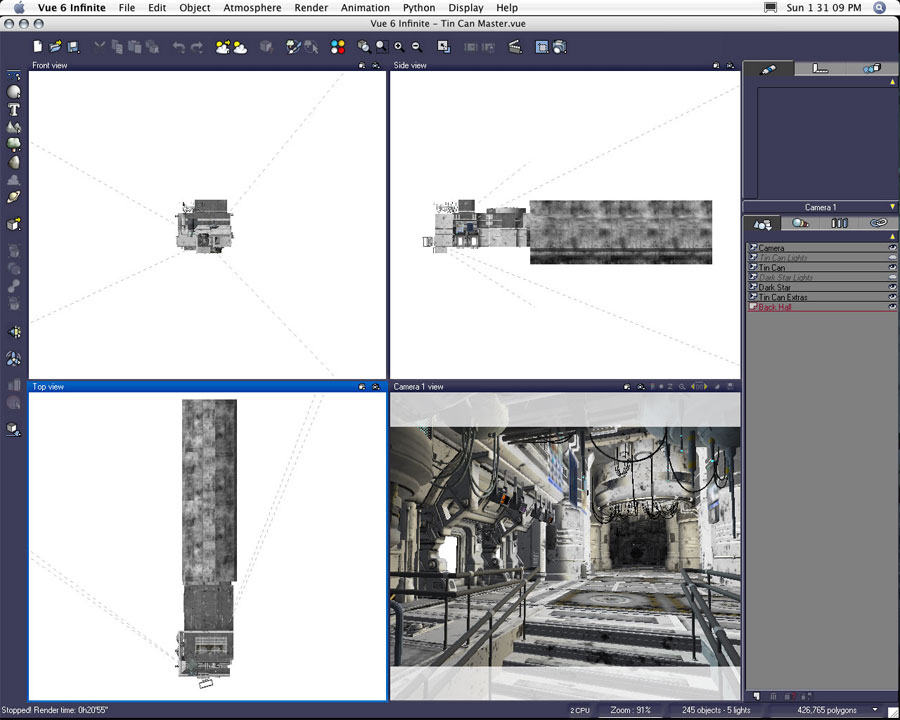
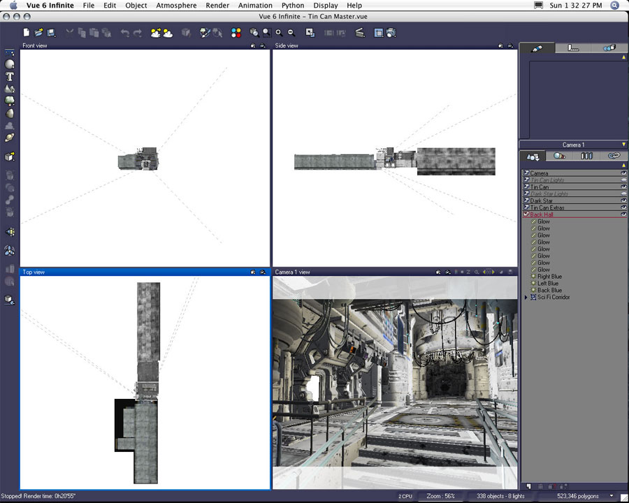
This was the Lirhful Station master file used for the merge.


This is the same file with the addition of the foreground "merge" elements. The figures and additional foreground objects have been removed. You may note in the top camera pane/view; the Generic Sci Fi Corridor has nearly doubled the length of the set.


This is a new render. The camera has been moved from its original position and reset to a 35 mm focal length at the end of the Sci Fi Corridor. None of this corridor is directly seen in the final Lirhful Station image, but it did exist in the file containing the foreground figures. If you look intently at the bald gentleman in the final image, you should be able to see subtle reflections of this hallway in his right shoulder/back area. I'm a firm believer small details like this really do increase the reality of an image.

Although I did very little materials editing on the corridor, I did change all the objects designated as lights to object-based area lights. There are roughly fifty of these converted wireframes. In the forward left portion of the corridor there is an entire room illuminated by a dozen or more of these lights. Again, none of this is really seen in the final image. But I did take a lot of time fine tuning each of the lights in order to get just the right amount of illumination and reflection in my foreground figures.
Final Files Begin to Take Shape


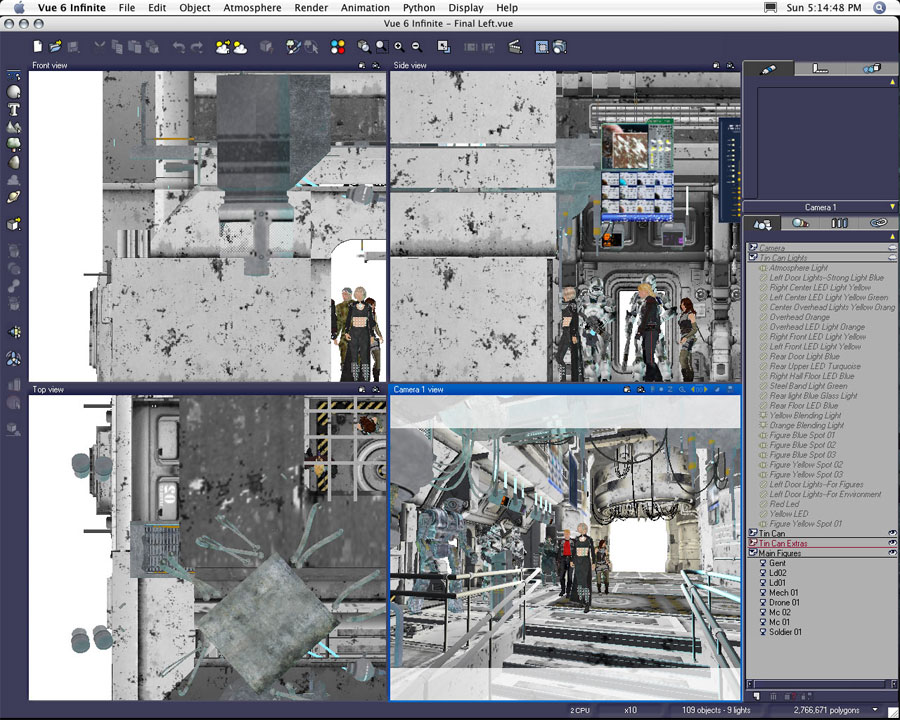
This is what was eventually a merge of my "main" or "middle figure" document and my "foreground left" document. Originally I had planned on rendering this portion of the image as two separate pieces. I found a true reaction of light and reflection was very dependant on all of these figures existing in one file.

I cut the polygon count by deleting every non-essential object and decimated the two figures in the back from 500 thousand polygons each to just around 100 thousand polygons each. The file still contained 2,766,671 polygons. This file is still problematic. I can't really edit any of the figures positions or materials without causing Vue to crash. If I need to edit anything, I have to go back to the two resource files, perform my edits there, save the changes, and "re-merge" the two halves back together.

This file also doesn't like to open. I have to start Vue from scratch--even better after a full restart--in order for the file to open without failing. The document takes about twenty minutes to load in full. Once loaded, I was able to select my render area and render the necessary portion of the scene.
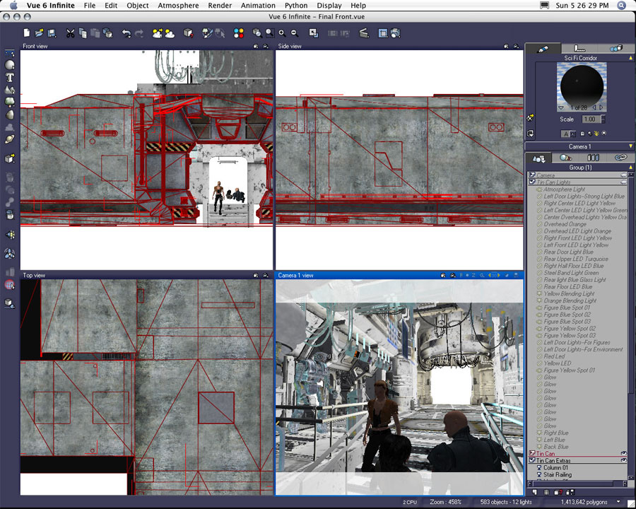
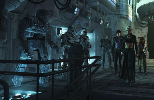
This is a screenshot of the final foreground portion of the image. I opted to merge portions of the final left document into this scene in order to keep light and shadows consistent. The soldier figure in the background was brought into the scene because I found it difficult to render a nice alpha map of the female figure descending the stairs due to the transparencies in her hair. By keeping the overlapping figures together in this scene, I was able to avoid the transparency halo around her hair in the final composite.


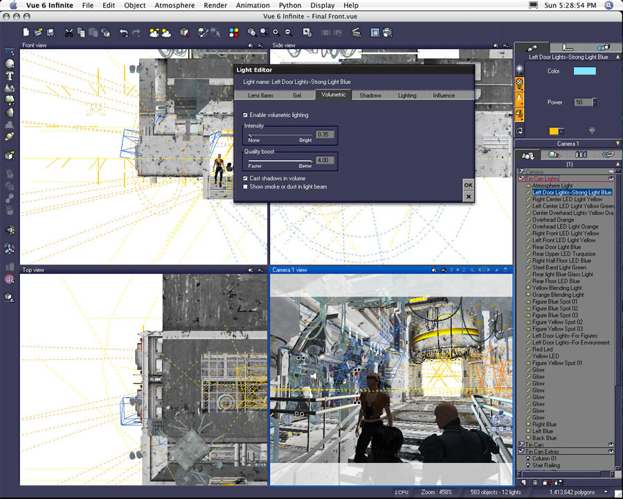
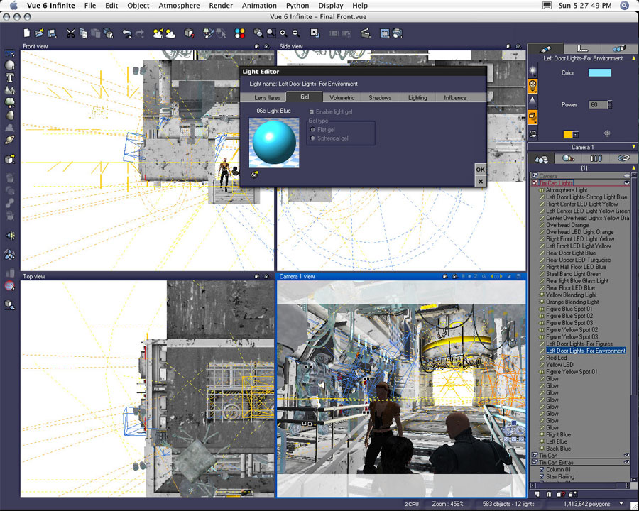
I'm a light junkie. I've tried to quit, but I find myself packing as many lights into a scene as possible. One of my new habits is to duplicate one light several times for effect. In this first example I have the original left door lights set up as a volumetric light with a strength/power of 50. The volumetric settings are detailed above.

This happened to be just the right amount of volumetrics to suit my taste, but I ultimately decided I wanted more illumination from this light source. If I bumped up the strength of the illumination, the light produces too much of its volumetrics. It gets too thick, and the volumetrics extend too far into the scene even when I dial down the amount of actual "volume" in said light.
A Few Notes on the Duplication of Lights


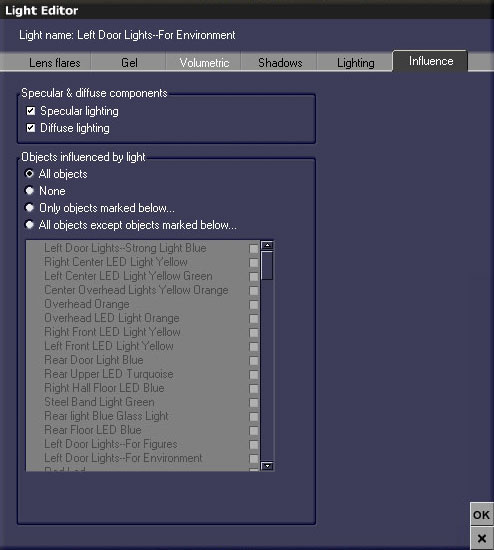
Solution: create a duplicate light for the sake of casting more non-volumetric light. I just duplicated the same left door lights, disabled the volumetrics, and pumped the power of the second light up to 60. All the other aspects of the light are the same: gel, shadows, lighting, and influence.

The gel, as seen above, started as one of Vue's basic plastic materials. I applied the installed preset to the original wireframe object before transforming the objects into area lights. I modified the materials settings before the object transformation because I have found the converted area lights aren't always receptive to changes in their materials. Once an object has been converted to an area light, material edits to the light gel can lose opacity and color information. By making choices for a material on an object prior to its conversion to an area light, I have avoided the "glitches" in the gel settings of the light.

It's also a good idea to keep copies of the original object wireframes handy. Before converting an object to an area light I like to duplicate the object, store the original on a hiding layer, and use the duplicated object to create my area lights. In the event I edit a light too extensively, or I make a later decision to remove the light and return to the original object, I then have an original object tucked away for just such an emergency.
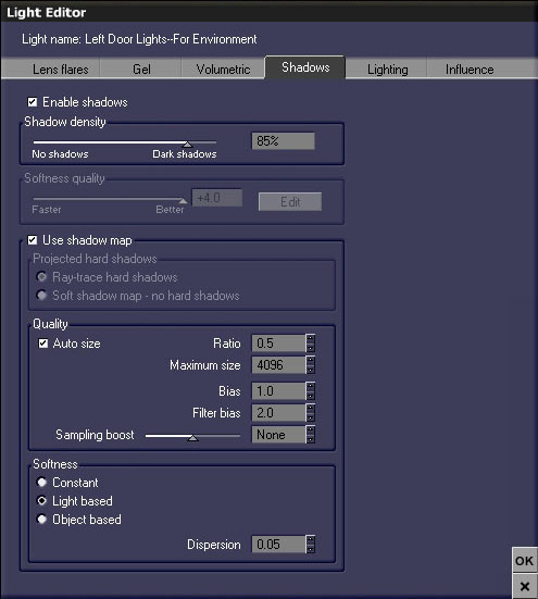
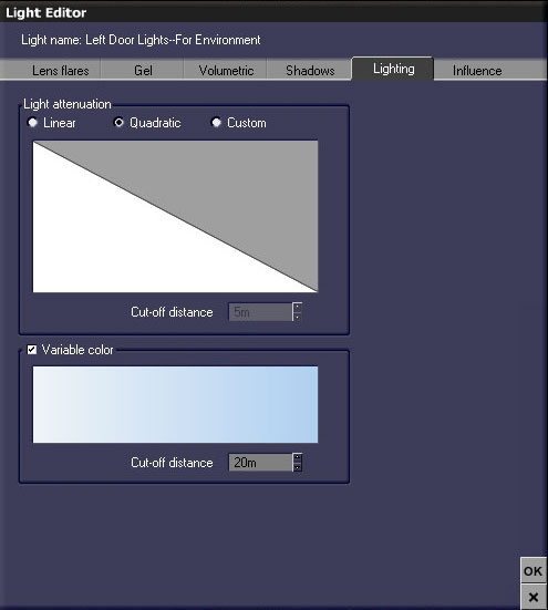
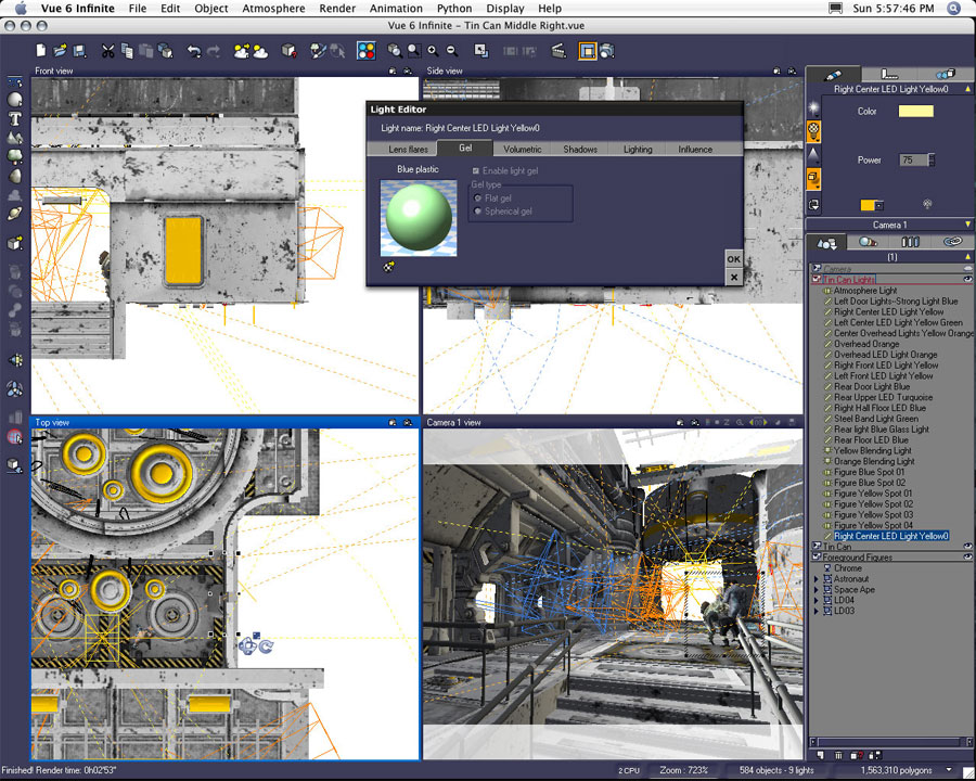
With the exception of Volumetrics, the left door lights share all the same settings. Lens flares aren't used. The gel is that light blue plastic material, and the shadows have been set as seen in the above screenshot.


The left door lights are all quadratic in nature and share the same variable color. All of the lights in the scene are quadratic. I use linear lights very rarely. I prefer the decay or falloff of the quadratic lights.


Now both the first and second examples of the left door lights influence the entire environment. The first light adds the presence of volumetrics, and the second adds additional illumination to the environment as a whole.


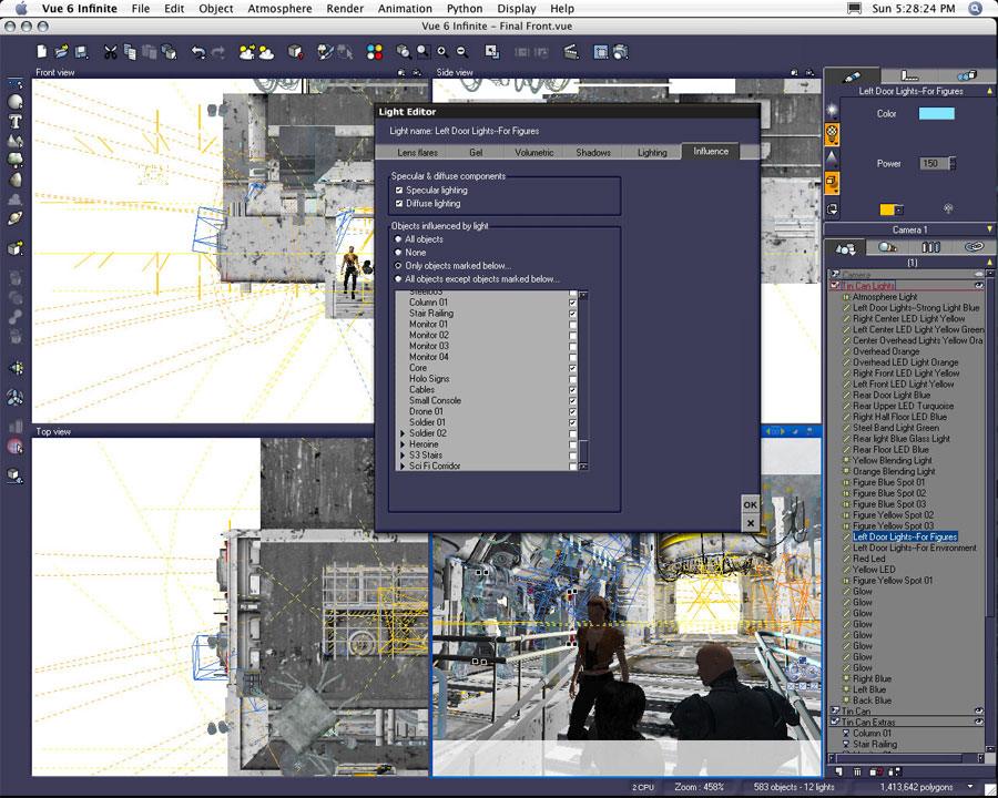
This particular example shows I've used three copies of the same light. The third copy of the left door lights affects only selected figures--not the entire environment. This third light is also the strongest. The power of this left door light has been set to 150--three times the amount of illumination given to the first "volumetric" left door light. I used this light to push the highlighted edges of my figures.

By using three duplicates of the same light I found I was able to manipulate the illumination of the scene selectively. The first adds a certain amount of illumination and a desired amount of volumetrics to the scene. The second left door light added extra illumination to the entire scene, and the third version brightened the highlights on figures.
Maximizing the Placement of Multiple Background Figures


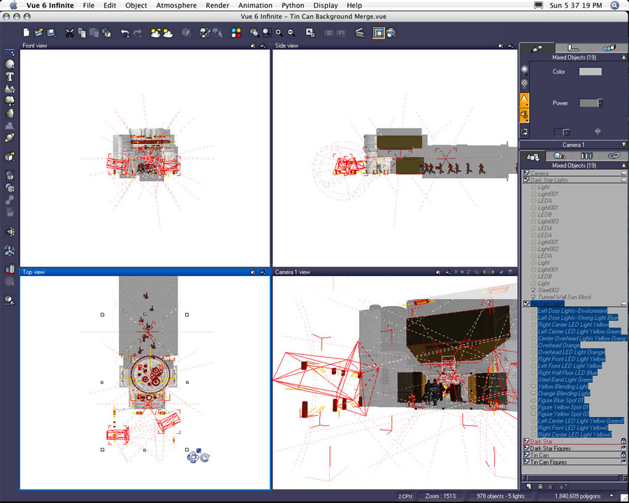
This file is the "merge" of the previously established far middle ground area and the Dark Star background containing an additional 16 Major Cache figures (Major Cache is a M3 clothing item created by Uzilite). I'm going from memory here, but I think there are 22 figures in total in this scene. Since each of the figures originally averaged about 500 thousand polygons each, I had to decimate all of the figure objects in order to get them to fit in the scene.

The level of decimation directly relates to the figure's positions relative to the camera. The figures closest to the camera have been decimated to approximately 125,000 polygons each. The figures furthest from the camera have been decimated to as little as 60,000 polygons each.

I've also highlighted the lights in the foreground. Since most of the immediate foreground elements have been removed, I did keep all the original lights in place in order to keep the illumination consistent.
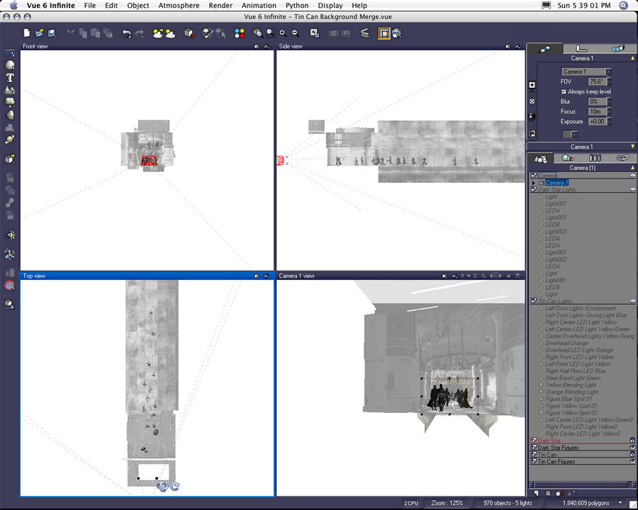
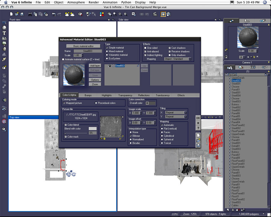
Here's a different view of the same scene designed to give you a better idea of the placement of the figures within the interior space. You can also see the selected render area which was used to create the final render for the portion of this scene. It seems like a lot of work for so tiny an area.

A Few Notes on the Station Interior Materials


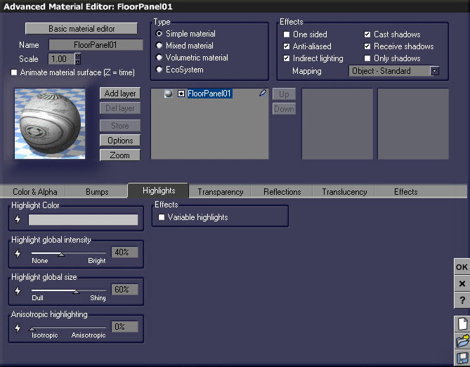
Previously I've mentioned I like to use small amounts of reflection in many of my surface textures in order to "fake" a certain amount of radiosity in my images without resorting to using actual global radiosity settings in my renders. I want to point out a few example materials from the Tin Can interior.

Early in the creation process I had the idea I wanted to make the station interior neutral in color scheme. I wanted the color of light to affect the perception of color on the surfaces of the walls, floor, etc. The original models came with fairly colorful image-based texture maps. I brought the original texture images into Photoshop and desaturated them--essentially turning them into grayscale images.

Once in Vue, I created a color palette of roughly twelve different neutral gray values. Each texture was then assigned a gray for color blend and an alternate gray for overall color.
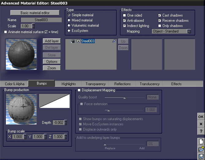
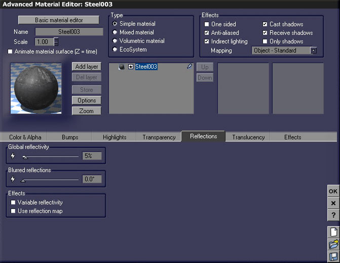
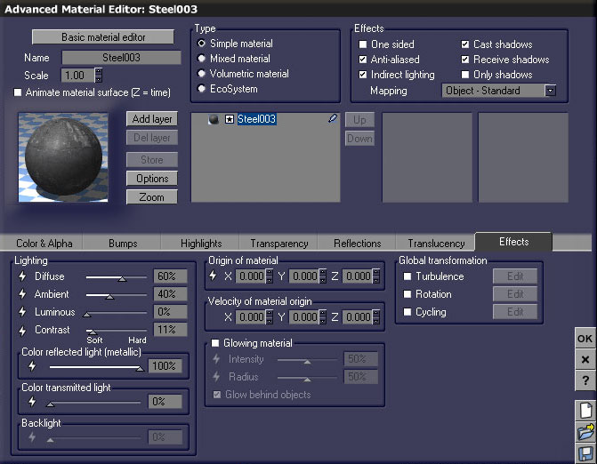
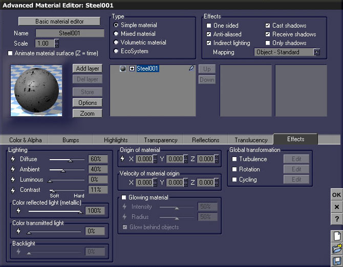
A grayscale version of each image file was created for use as a bump map. Various increments of bump depth were applied usually ranging from plus or minus .01 to .001. The example Steel003 texture has a depth percentage of -0.002.


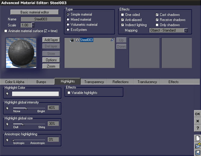
I varied the use of my neutral grays within the highlight color for each of these textures. Highlight global intensity and global size were also varied.


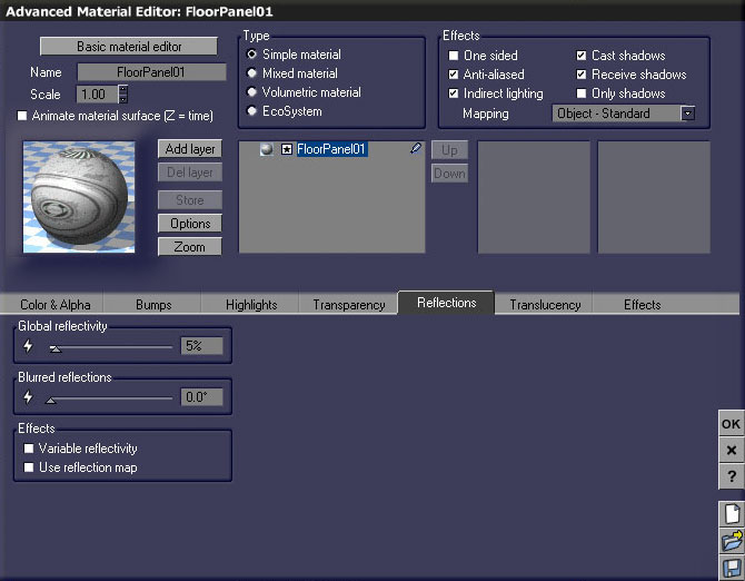
Transparency and translucency options weren't applied to these textures. I did apply 5% reflection to this surface. Most of the interior station textures used between 3% to 11% reflection.


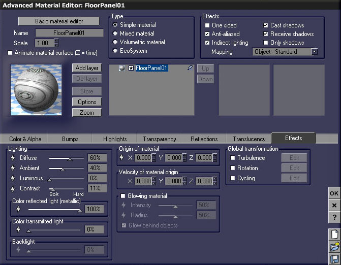
I left the traditional lighting values in their default state as shown. I did employ 100% color reflected light for this material.


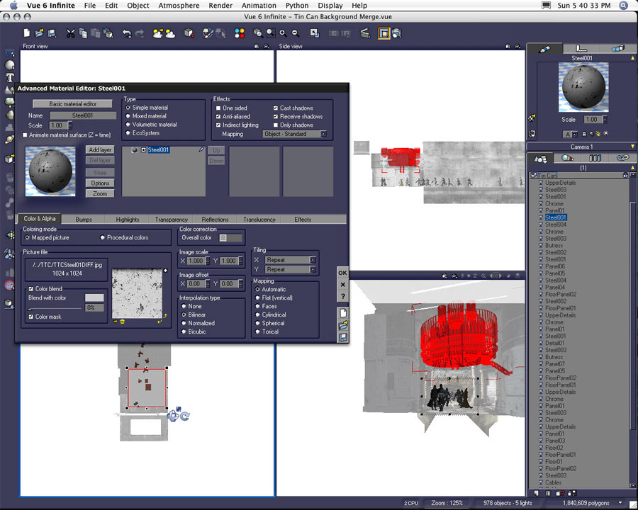
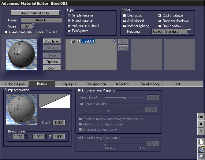
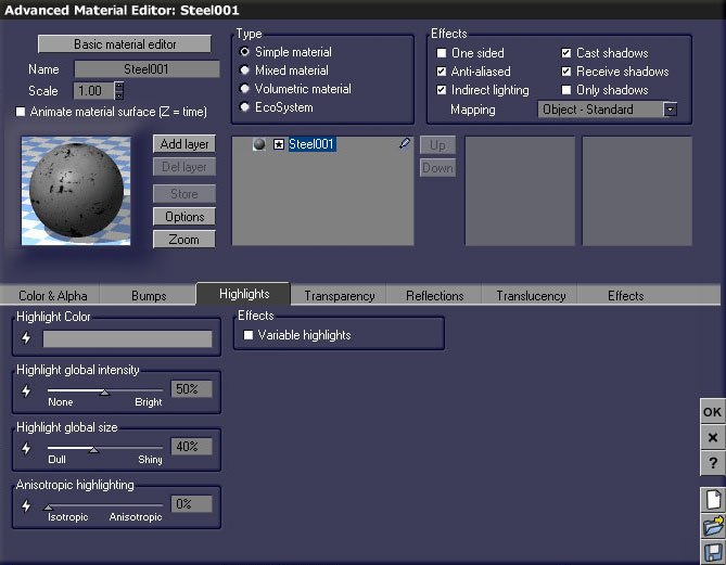
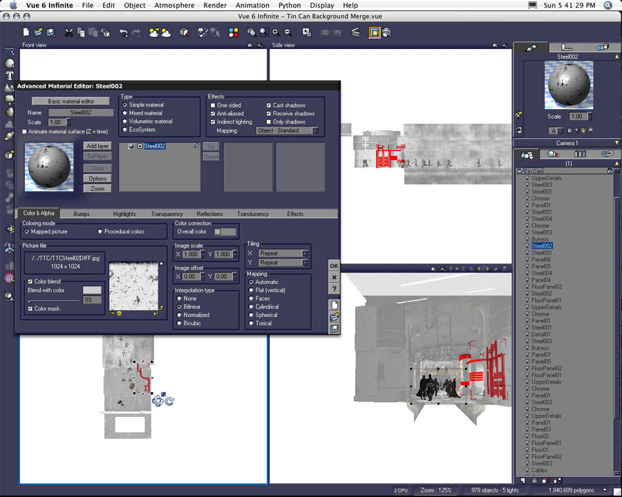
In the second example material, once again the original image map was desaturated, and neutral grays were applied as color blend and overall color values.


Here too a grayscale bump map was applied. The depth was set to -0.004.


Highlight color is again a neutral gray. Global intensity and size have different values than the first example texture.


The effects settings for the second material example are the same as the first. No reflection was added to this material. Since this material was used on the center light display, I found the use of reflection was unnecessary. I tried using reflection on this surface in earlier renders, but the number of lights in close proximity made this a costly choice due to increased render time. In addition, the resulting reflections looked too busy. They were too distracting. The center light display is an interesting object in itself and the 100% color reflected light value produced a desired effect without the use of reflection.


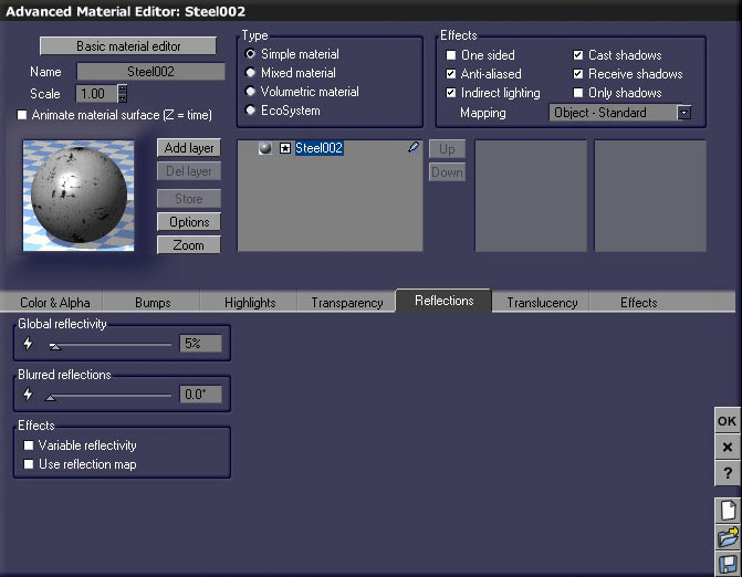
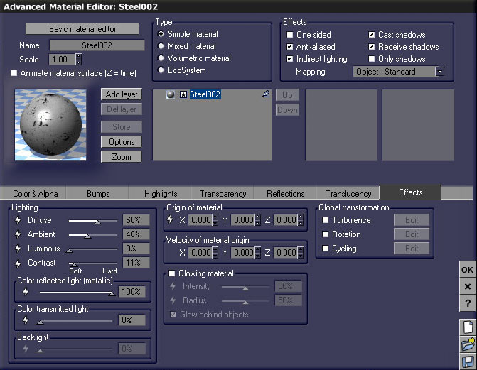
This third texture, Steel002, uses the same image-based texture map as the previous example. I varied the use of my gray values within the color blend and overall color of this material.


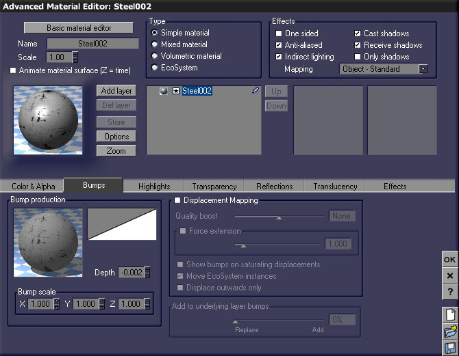
Bump information is also similar. Here I returned to the use of a depth of -0.002.


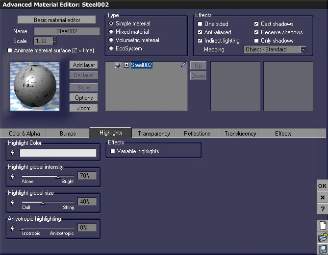
The most dramatic difference in this texture is the use of a lighter neutral gray value for the highlight color and greater amounts of global intensity.


A 5% reflection was also added to this Steel002 texture.


The effects variables are consistent with all three textures.


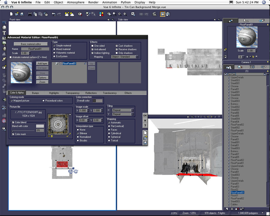
The fourth texture example is one of the floor textures. Although I did desaturate the original image-based texture map, I did leave the yellow striping in color. The material is still treated with different neutral grays for both the color blend and overall color values.


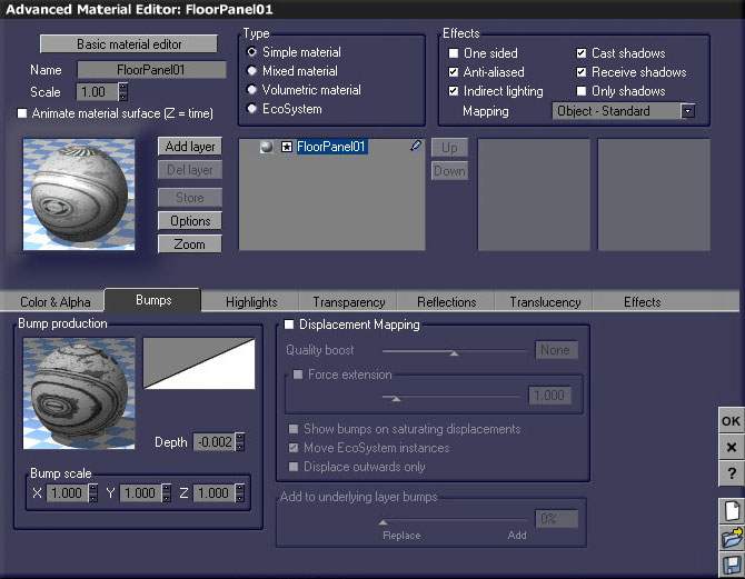
And again, a minimal amount of bump depth has been applied using a grayscale image.


The highlight information differs from the previous textures.


A 5% amount of reflection has been added to the material.


The effects tab is the same as the three previous textures. These texture examples may not be terribly informative, but I did want to point out the subtle variations in a handful of these materials. The material differences really came down to how all the different values of gray affected the overall color and color highlights. It was the light in this scene which became the delivery method for color on the interior surfaces of the space station.

Figure Preparation Part Two: Luminous Materials


I did create all of the figures in this scene using Poser and a variety of content found at www.daz3d.com. As I worked on the placement of figures in the scene, I averaged the creation of between two to four figures a day. Each of the figures was brought into its own Vue document to be edited.

When I imported the two Major Cache (again, product created by Uzilite) I placed them together in one file. Since both figures shared the same textures I found it was easier to edit the textures simultaneously on the two figures in this file. I later copied the textures into a materials library in order to apply them to all the background Major Cache figures used later in the scene.

Although the figures were originally created as separate Poser documents, I did find it was also easier to position the figures here in their separate file. They were then saved as a Vue document and merged into the corresponding Lirhful Station file.
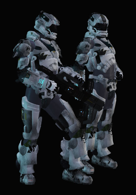
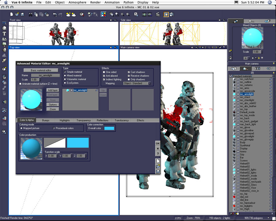
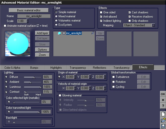
I mentioned earlier I created some area lights out of LED objects on the Drone Trooper. In hindsight, I didn't really need to create those lights. At some point I tried the same object to light conversion on the Major Cache figures. Specifically, I tried to create lights wherever you see the light blue glowing materials. Since the amount of light I was using for these objects was so inconsequential, I opted to use luminous materials instead.


Like the previous light gels, I started with a basic plastic material from Vue's default materials libraries. I adjusted the procedural color and overall color to suit my taste.


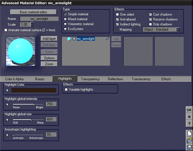
I dimmed the highlight by reducing the highlight color to a dark gray.


Last, I bumped up the luminous and color transmitted light values to 100%.

A Few More Notes on the Use of Lights


Occasionally I would make so many changes to lights within one of the scene files I found it was easiest to export them from one file into another via a "merge." So many lights were created on the left side of my scene which ultimately would affect figures on the right (as seen above).


In addition to the lights imported, I again employed the technique of duplicating lights for the sake of illuminating or highlighting selected figures.

As I mentioned earlier, I wanted the lights in the scene to define color on the neutral grays of the Lirhful Station interior. Lights in the foreground exist in several shades of blue. As you move back in the composition, the lights change from aqua, to green, to yellow-green, to yellow, to yellow-orange, to orange, to scarlet, to red, to crimson. The light selected in the screenshot above is one of the green lights on the right wall within the middle ground area just in front of the astronaut and ape figures.
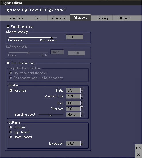
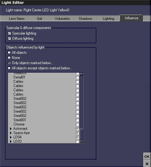
In addition to the variation of colors, I also varied the shadow density of my lights. I usually kept the values between 80% to 95%. I chose to use shadow maps on all of my lights.


As in the earlier example, I duplicated lights in order to provide extra illumination to figures without affecting the entire environment.


In addition to the object-based area lights, I created several point lights and spot lights within the scene. I'm pretty sure all the point lights affect the entire environment, but the spotlights were often created as pairs--one to affect the environment as a whole, and a second to provide additional illumination to only selected objects or figures.

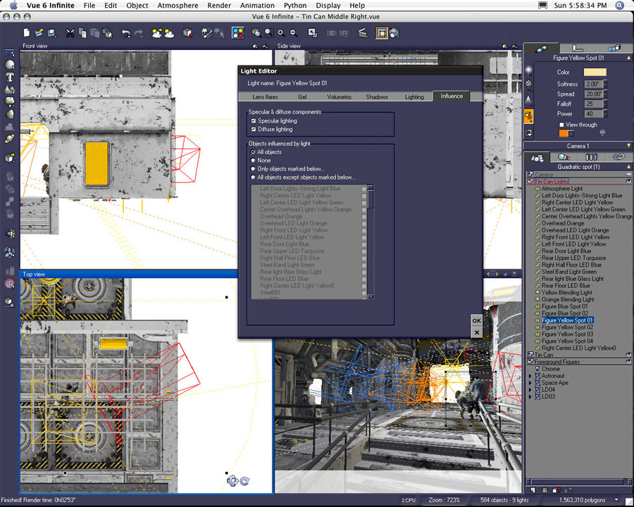
In the above example, Figure Yellow Spot 01 was created to provide the entire environment with light values set at a softness at 2.00, a spread of 20º, a falloff of 25, and a power of 40.
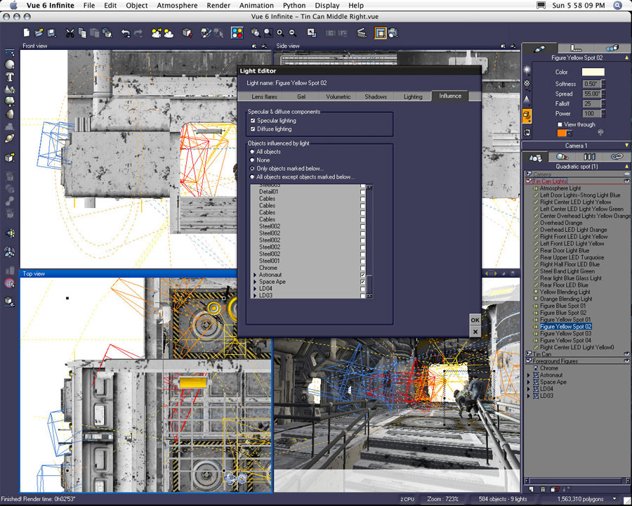
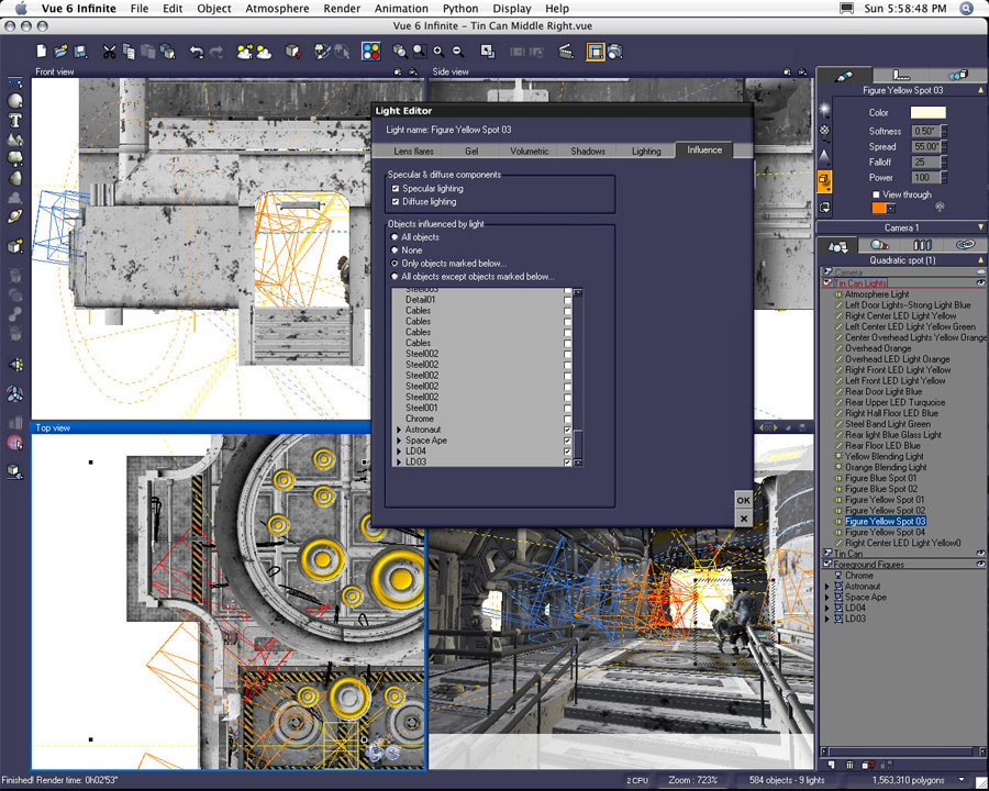
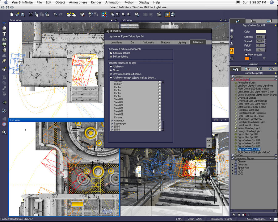
In this example, Figure Yellow Spot 02 was duplicated from the previous light but moved to a new position in front of the figures. This spotlight was set to only illuminate the astronaut and ape figures with light values set at a softness at .5, a spread of 55º, a falloff of 25, and a power of 100.


Then by duplicating Figure Yellow Spot 02, Figure Yellow Spot 03 was created and moved further into the composition to illuminate the astronaut, ape, amazon, and girl coming around the corner.


The light was duplicated once more and rotated slightly to illuminate only the astronaut, ape, and amazon figures.

I know I create a lot of lights probably more than I really need. I really like the ability to use individual lights on selected objects. I find I can build my scene and figure illumination incrementally without overpowering the entire scene when I work with this method.
Scene Atmosphere Settings


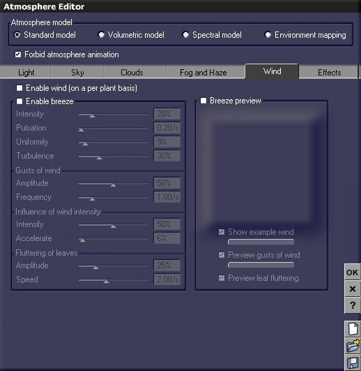
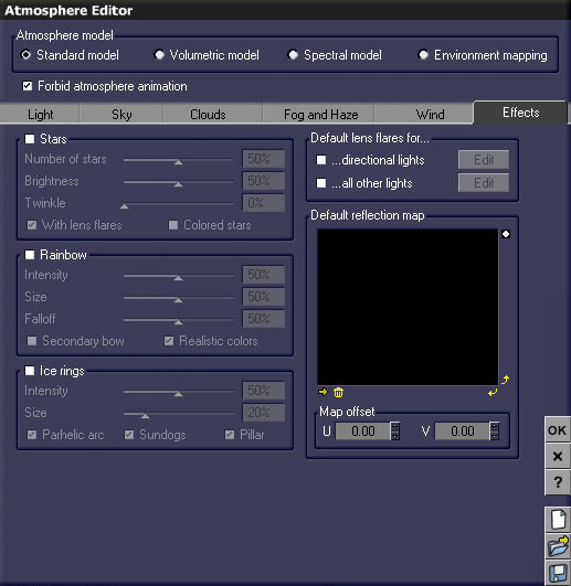
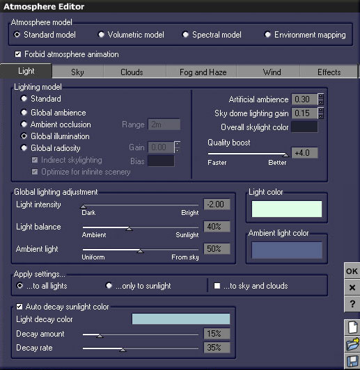
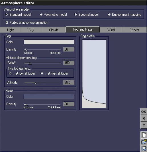
The atmosphere settings for this scene are detailed in each of the Atmosphere Editor screenshots. You might not be able to duplicate these settings exactly just from looking at the example images because the color choices I made would differ from your own, but you should get an idea of how I set up the atmosphere.

I defined the atmosphere very early on when I first started working on this scene. Although I made a few changes as the scene progressed, the atmosphere values have stayed pretty consistent. I did find myself changing the lighting model from Global Ambience to Global Illumination on occasion. I also tried using a volumetric model, but I found I preferred the amount of atmospheric volume I created just by using volumetric lights, haze, and fog within a standard model environment.
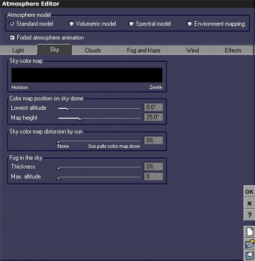
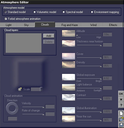
There is actually no sun or directional lighting used in any of the scenes. I kept the sky black and preferred to light my scene with only the lights created within the interior space of the station.


No use for clouds either. I kept the atmosphere as simple as possible.


Just a little bit of fog and haze were added to the scene. Fog and haze, along with addition of a few volumetric lights, provided enough particle distortion in the scene in order to reinforce my figure ground with atmospheric perspective.


No use for wind either. I don't think I've explored these options on any of my previous work either. One of these days I will need to use wind.


Nope. None of these effects were used. I really don't like lens flares, so I try to turn them off whenever possible. I did explore the use of stars much earlier in the composition of this scene, but ultimately the visibility of outer space through windows was obstructed by too many figures.

Scene Render Settings


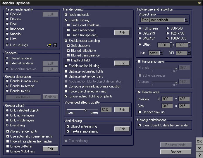
I thought I'd share screenshots of the final render settings I used on this project. When I needed to render tests I usually use the "Final" setting. On occasion I might use "Superior" or "Ultra" settings, but I found myself not really satisfied with the overall quality of "Superior," and "Ultra" just took too long to render.

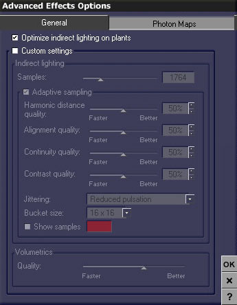
I found a happy medium with the user settings I created. The final setting used an advanced effects quality of 60%. Prior to settling on this amount, I tested settings as high as 80%. I found the difference was negligible in overall quality--in fact the higher settings made the render look too crisp. The 60% settings seem to add just the right amount of blur or distortion to the rendered pixels. It left a subtle hint of grain, but suited my aesthetic.

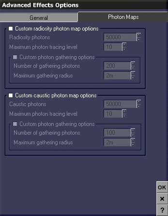
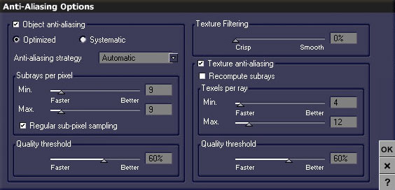
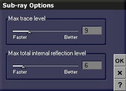
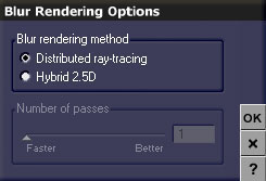
The screenshot above is how I set my render options. The following screenshots detail each of the options I placed in the editable tabs of the render options window. You should be able to re-create this custom user setting by looking at the example screenshots.
Compositing the Final Renders

This was the first of the final renders. Just the base without any of the figures present. All of the additional renders were eventually added to this file in Photoshop.

After each of the final renders had been completed, I would then go back and render separate alpha maps for each object I thought I might need to separate later in my composite. I found the easiest way to achieve quick renders of the object alphas was to render using the same aforementioned render settings, but with the options of rendering "Only selected objects" turned on and "Always render lights" turned off. The color renders would render blank or as black with all of the lights turned off, but the alpha maps (or channels) would render perfectly. Each of these alpha map renders would finish in one or two minutes time.

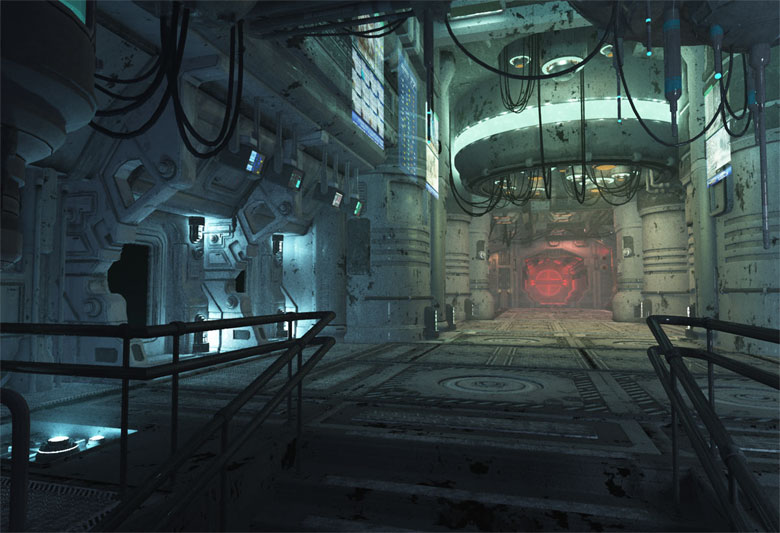
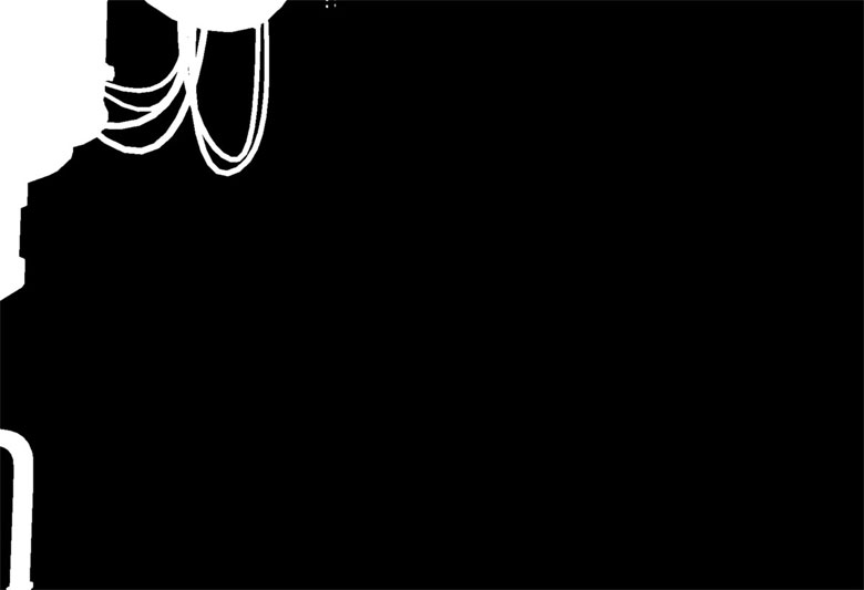
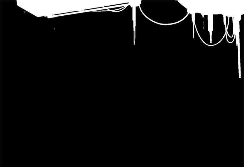
I thought it might be important to separate these objects into their own layers later on, but not all of the alpha maps were used. The previous alpha map of the left side column and this foreground "Core" element are both examples of unnecessary alpha maps. I placed both the alphas in my final composite file as alpha channels, but I never used them to actually select out either of these elements. I kept both of them around just in case I thought I might need to separate these elements from the image as I worked through the composite.

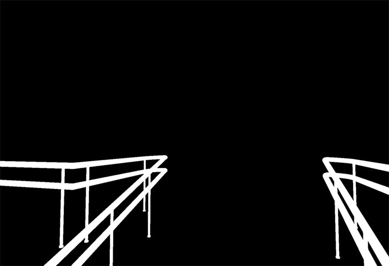
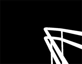
The above railing alpha did end up being useful. I found there were small differences in lighting and color which existed on the railing between the separate final renders. Later, after each of the five renders had been placed in register within the same file, I was able to use this alpha channel as a selection in order to mask the preferable areas of the railing from each of the separate render layers. Thus the railing, as seen in the final image, was created from a blend of each of the four final renders containing the object.

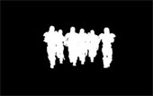
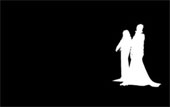
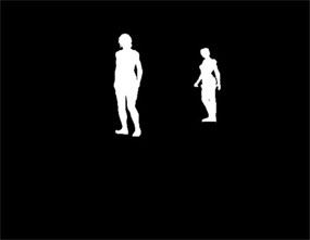
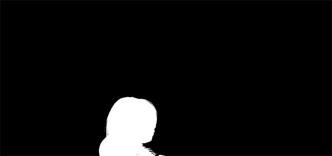
The far background render was the smallest of the final renders. Because of its size it took the least amount of time to render. After the selected area render had completed, I was able to go back and create the four additional alphas seen here. The two soldier figures selected in the first alpha map were not rendered into a separate alpha. If I needed to select those two figures, I knew I could subtract the third and fourth alpha maps from the first one in order to be left with just the two soldiers selected.

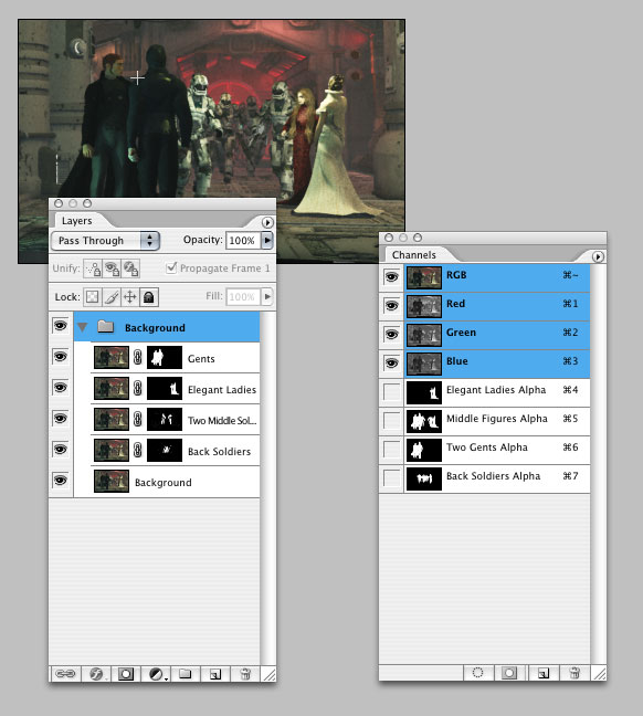
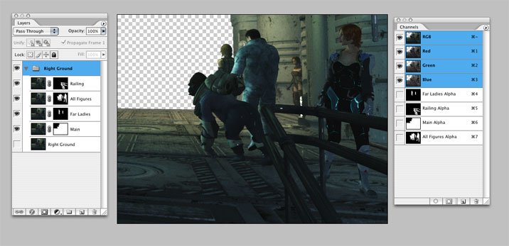
Here's an example screenshot of the final background figure file as it was prepared in Photoshop. Once the final color image was opened, I created a new channel for each of the prepared alpha maps. The alpha maps became alpha channels just by copying and pasting them into the blank channels. Then figures were selected away from the original background in duplicate layers by loading the corresponding channels as selections and applying each of the selections as a layer mask.

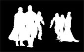
When it came to the front left portion of the image, I was able to render all the figures together as shown. I goofed up on the alpha maps, however. After rendering the color image I forgot to save the original selection area I used for the render. So I created the alpha maps as shown using a smaller selected render area. This added a few more steps in my Photoshop composite because I wasn't able to just paste the alphas into channels. First I had to paste each of the alphas into the color file as separate layers. Then I had to register each of the alphas to their corresponding figures. Once the alpha was registered, I filled in the transparent areas of the layer with black. Then I copied and pasted the finished layer into a new channel. After completing this process for each of the four original alpha maps, I then deleted all of the black and white alpha map layers from my file.

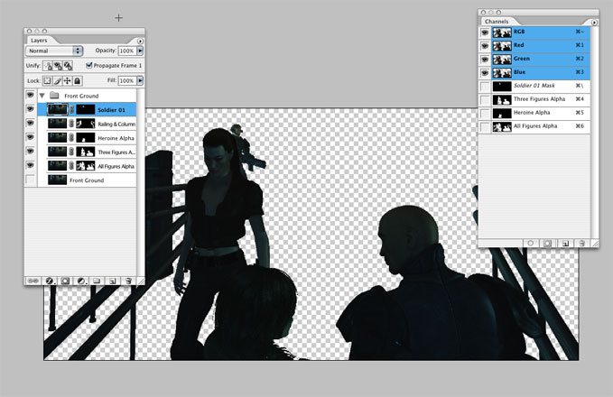
Again you are able to see an example of how this section of the image was prepped prior to being composited into the final document. Also note, I placed all of my layers together into one layer group. Later, when I would bring all of the separate renders together into one document, the layer groups for each of these separate renders were easily placed from one file into another just by grabbing the folder icon from each of the separate render documents and dropping it the layer groups into the master file.

Here's the right side final render and the corresponding alpha maps...

...and an example screenshot of the composited alpha channels used as masks.

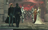
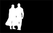
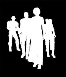
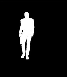
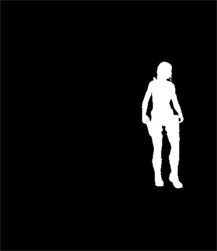
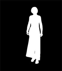
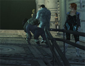
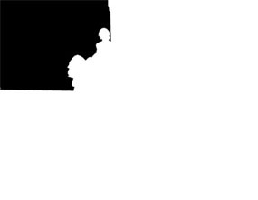
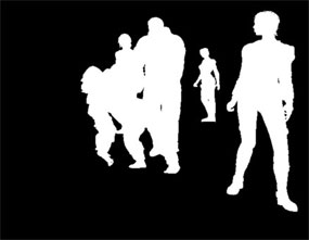
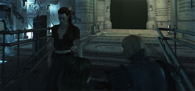
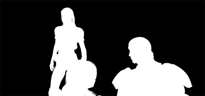
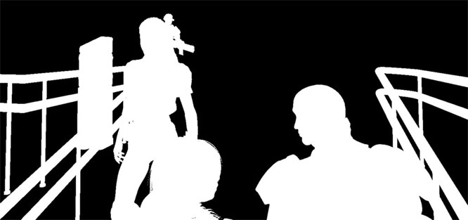
Last, the foreground figures were rendered into their own image and these three alpha maps were produced. Note I brought the droid figure, the small console, and the soldier from the left portion of the image into this file for the final render. I brought the droid and the console into this file because I thought there were a few small variations of light and shadow emanating from these objects which would affect the three foreground figures. The soldier was placed in this image because I discovered the transparency matte created in the alpha map of the female figure overlapping him created an unwanted halo effect in previous test renders. I avoided the unwanted transparency halo in the female figure's hair by bringing the soldier figure into this render.

Here you can see how the figures could be separated from the background for placement in the final image via the use of those alpha maps as masks/channels.

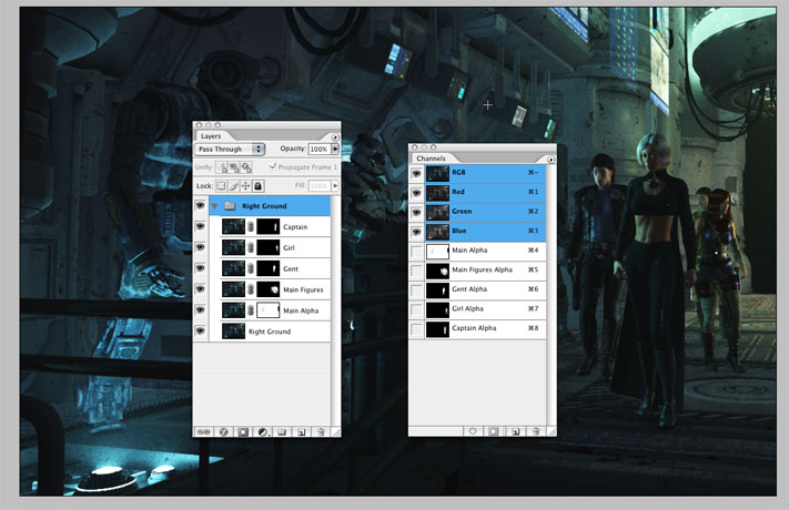
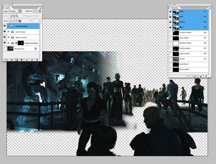
The above screenshot is an example of how the files were brought together into one Photoshop document. The separate layers were then blended together by painting into the individual masks. Now even though I separated out most of the figures into their own layers within the individual render documents, not all of these layers were used in the final composite. I deleted all the unused duplicates from the final file. I created all those separate layers as a means to give me plenty of options in the final composite, but once I had them placed in the final image, I found I really didn't need to use most of these separated layers.

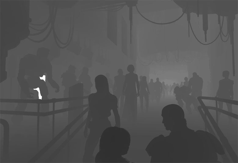
One last note on the composite of the image. The above image is the depth map created for this image. Just like the final color image, the depth map had to be composited together from separate renders. I saved the depth renders for each of my images and brought them together in order to create a complete depth map. As you can see in the channels palette of the previous image, this depth map has been made into a channel within the final composite.

I used the depth map channel as a selection in order to add a few effects to the final image. With the depth map loaded as a selection I added a little Gaussian blur, adjusted saturation, and adjusted the levels within the final image. Quick and easy--this technique brought out most of the subtle atmospheric effects in the final image.
Progression of Renders from 11/06 to 1/07


This is kinda fun. I did save a whole bunch of my early test renders. Most of them were rendered using the "Final" render setting. Above is a simple Flash composite of the scene. Below are the individual render composites which detail my progress. Enjoy!


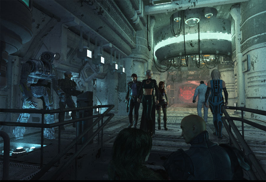
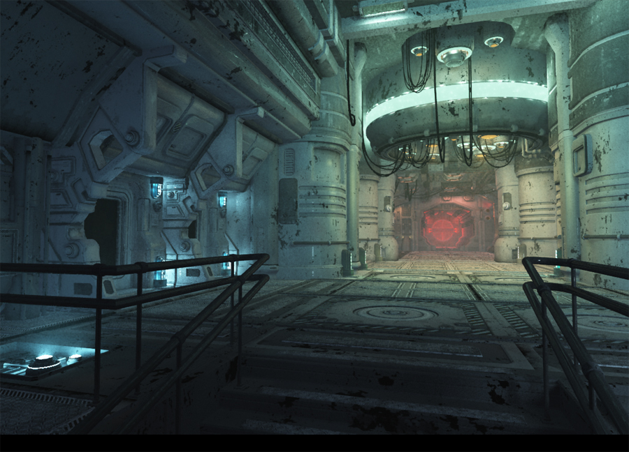
A render using the "Superior" render setting. This render was executed circa Thanksgiving 2006. The render was created after completing the creation of the entire station interior. I took a break from the project for a few weeks after the completion of this render.

I used this as a desktop background at home and the office from Thanksgiving until the end of January.
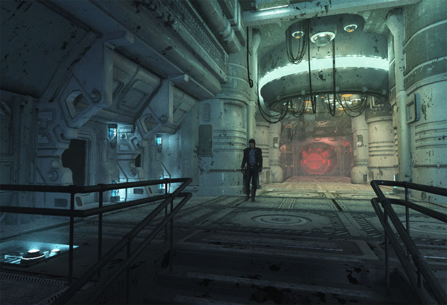

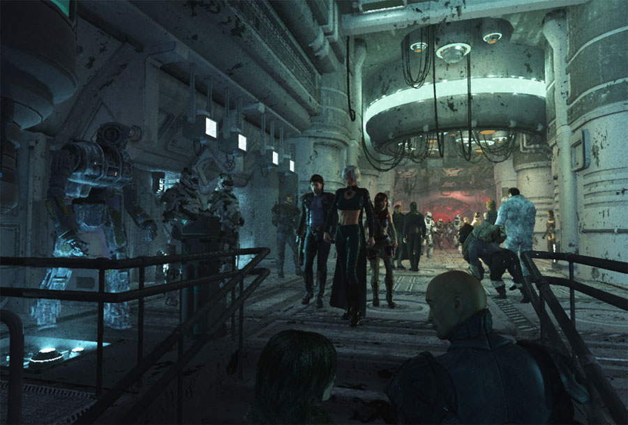
Right around Christmas I returned to this project and began importing figures. The "Gent" figure was the first to arrive. I didn't really have any good ideas on how I was going to populate the finished image at this point. All I knew was I wanted to fill the interior with as many figures as possible.

I also started to place these renders on the second monitor to my right. I use two big old CRT monitors on my home computer. The one on the left is my main display. The one on my right is usually unused when I am working in Vue. Since I could see the desktop of my right monitor without being obscured, I loaded the succession of each new render as a desktop picture in order to track my progress as I worked on these scene files.
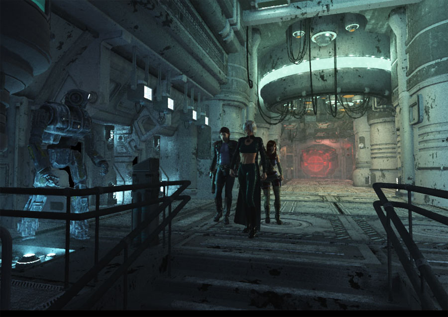
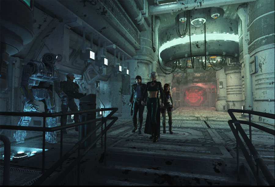
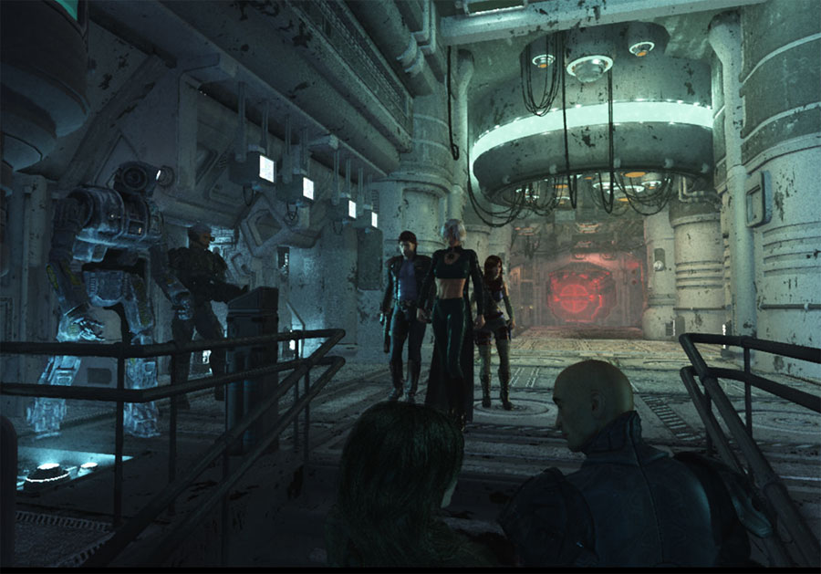
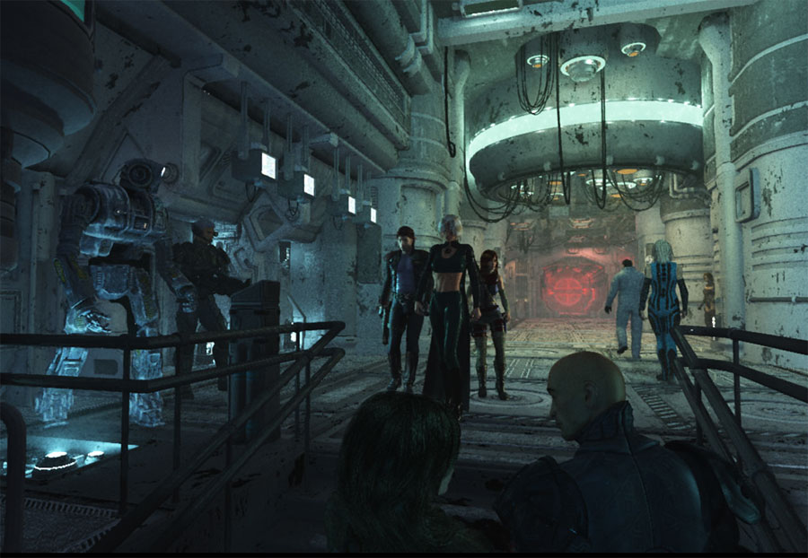
Once I placed the four figures you see here, I printed several color copies of this render and began sketching the other figures into position. I surprised myself because the final image does actually look a lot like my first sketch. I'd show you a scan of the sketch, but you wouldn't be able to see anything of value. It's too dark--a dark print to begin with and littered with gestures drawn in with a black Sharpie. Also the original sketch is covered with little illegible notes to myself.


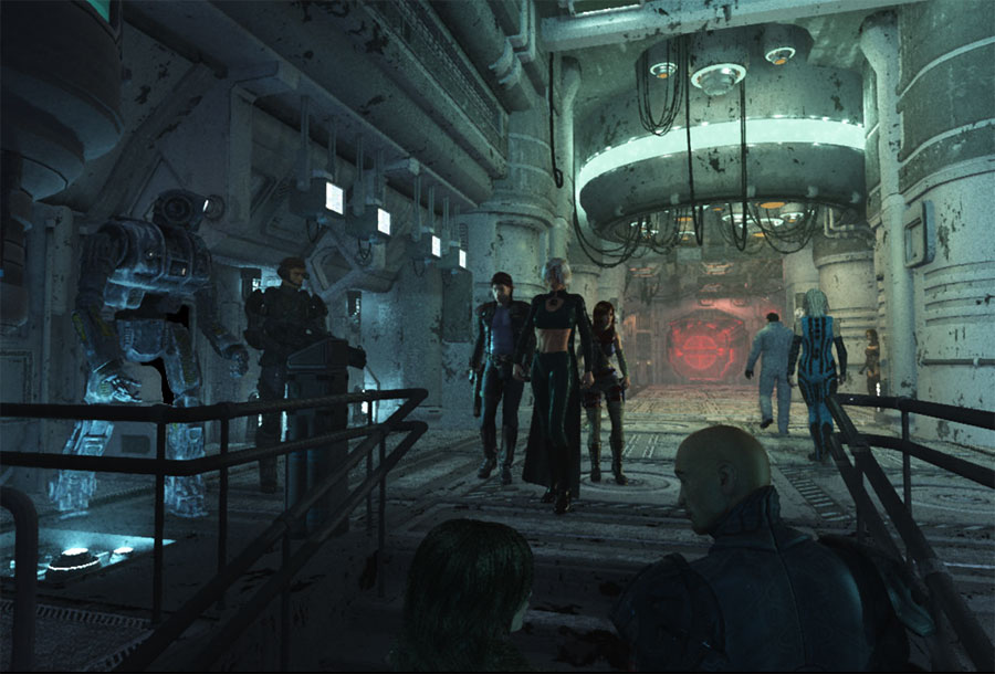
The soldier figure on the left was next to be added. This figure was ultimately moved much further back. His textures changed a few times between this render and the final image.


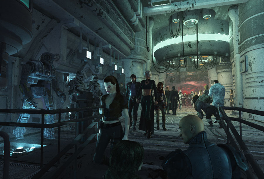
At this point I started breaking up my file into separate ground spaces. The foreground figures were rendered separately and brought into the scene using their alpha maps as a mask. The female figure in the foreground is too large and would eventually be sized down.


The figures on the right were next to be added. These figures were also created in their own scene file and composited into this image.


An additional figure--the girl coming around the corner--was added on the right. The position of the two previous figures was adjusted.


I turned my attention back to the foreground figures and adjusted their size and position.


The astronaut and amazon woman on the right have had their materials edited and their positions have been altered slightly.


Far middle ground figures are now being added.


The two elegantly dressed ladies have been added into the same far middle ground area. Their position and materials will be edited several times between this image and the final render.


Enter the Space Ape! John Van Fleet, a rather talented artist in his own right, put the Space Ape clothing model for sale as a Platinum Club item over at www.daz3d.com. It was made for Daz's Millennium Gorilla model and priced at $1.99 for Platinum Club members. I sort of ignored the Space Ape when I first saw it, but over the course of the next week, I kept thinking what if I put the Space Ape into this scene. Eventually I drew the gorilla into my scene/sketch. I liked the result. So I purchased the model and put the Space Ape in the same day.

Also note I started to place additional figures in the far background. All of these additional figures were eventually deleted.


More background figures were added. Elegant ladies were edited. Additional lights were added to the far middle ground. Much time was wasted.


At this point I started to cut back on the use of background figures. Some of them were deleted, and others were moved into new positions.

Note the astronaut and the ape switched positions with the blue-clad amazon.
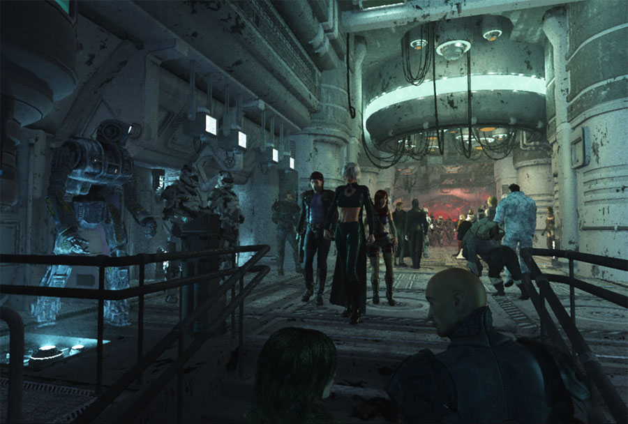

The two Major Cache figures were added on the left, and the soldier figure was moved further into the composition.


Returned to work on the background figures. Figure positions were adjusted.


At this point I started to add additional lights to the right side of the foreground.


Returned to work on the foreground figures. Added the third figure descending the stairs. Also played around with a few new lights in the foreground. These were dumped in favor of shadows later...


...but not before I tried a few brighter options.


The top portion of the composition was beginning to feel a little bare when compared to all the figures populating the floor of the hallway. I brought additional objects in to frame the scene.


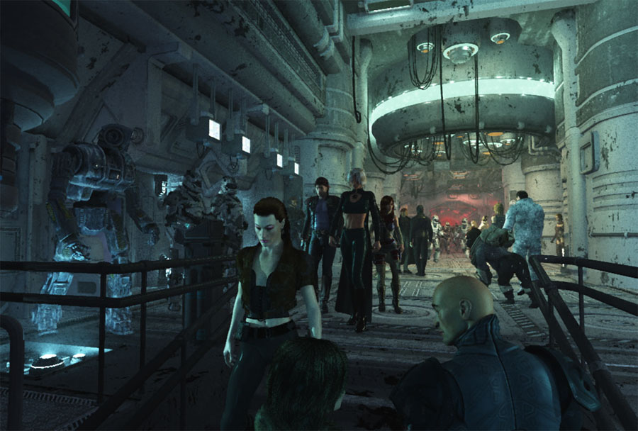
Second to last figure added--woman on the near right. The camera's focal length really distorted her figure. It made her seem too large even when scaled according to the rest of the figures. It also distorted her width--made her seem very squat.

The four monitors are now facing down towards the main figures.
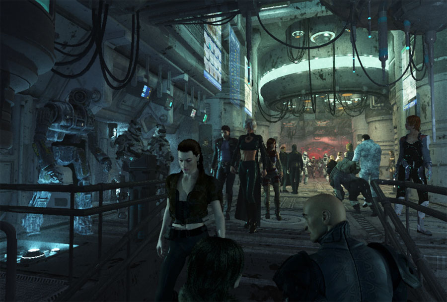

Played around with the turning woman's position, and I began to experiment with ways to counter the distortion caused by the focal length of the camera.


At this point I continued to edit the turning woman, and I really began focusing on developing the lighting on all the figures.


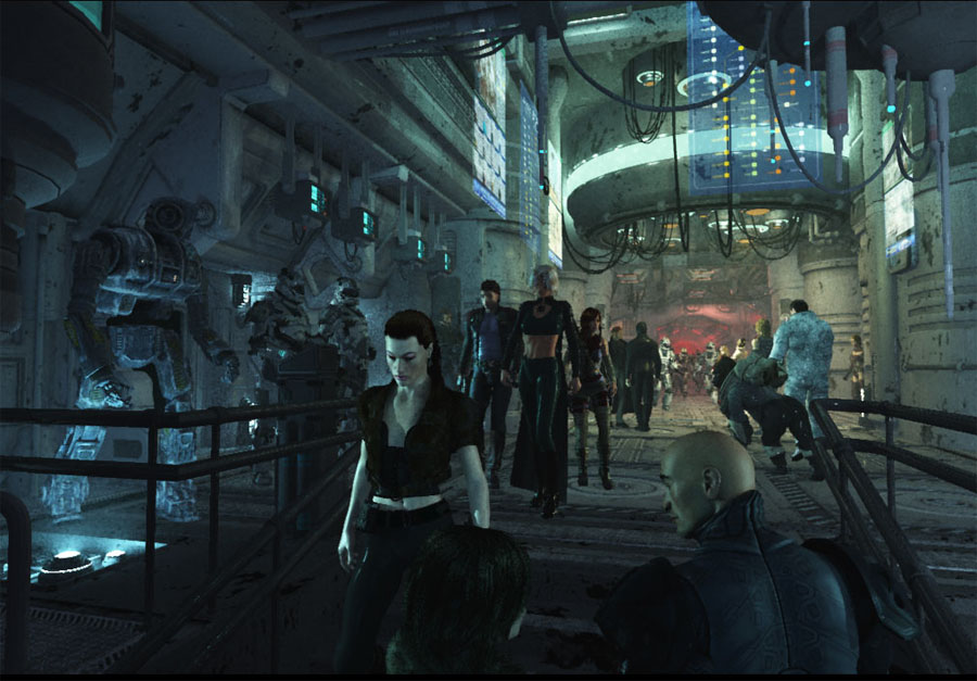
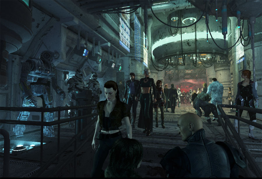
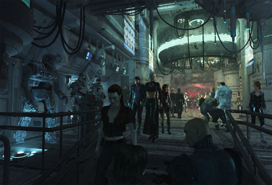
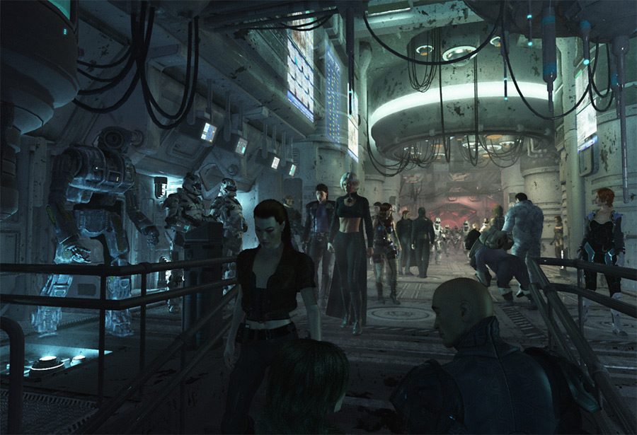
Now we're at the final render. A lot of changes were instituted between the previous render and the final. Every texture was double-checked. One more figure was added--the mechanic/soldier behind the three main figures. Dozens of lights were added, the turning woman was completely re-posed and re-imported. (I countered the focal length issue by increasing the proportion of the turning woman's height in relation to her width and depth.) The white haired woman in the center was also re-posed and re-imported. All of the left ground, near middle ground, right ground, and foreground figures had small changes in position. It took approximately four days just to make all the changes to my multiple Vue scene files in order to make the transition from the previous test render to this final render. This doesn't include the 100+ hours it took to render each of the five scene files.